Screenshot style breakdown
Sampled from 3 of 円を採点 -AI円診断-'s App Store screenshots — background, accent and theme, measured by LaunchShots (not something Apple publishes).
#04040C bg
#27272E
#3CFC14 accent
#FFFFFF text
Reading the caption text from the screenshots in your browser…
Screenshots
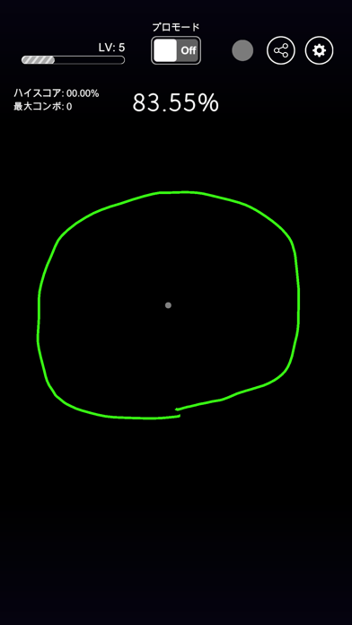
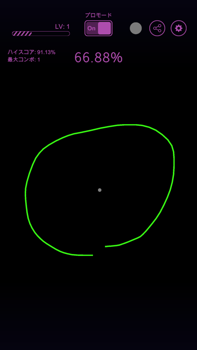
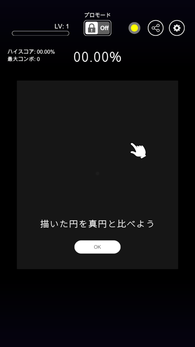
iPad screenshots


Icon palette
About this app
「円を採点 -AI円診断- 」は、あなたが描いた円を真円と比較し、採点するツールです。 毎回の描画によって経験値を獲得し、あなたのアートスキルを次のレベルへと高めます。美しい円を描けば描くほど、あなたの熟練度が向上し、その輝かしいスキルをSNSで披露できるでしょう。 このアプリは、あなたのアート技能を試す革新的なプラットフォームです。真円との比較でパーセント表示される採点システムに挑戦し、あなたのアートスキルを向上させましょう。 採点基準 90%未満の円であれば2ポイント 90%以上の円であれば10ポイント 100ポイントで新しいレベルに到達できます。さらに、90%以上の円を連続で描くと、コンボが発生し、2連続目で20ポイント、3連続目で30ポイントというボーナスポイントを獲得できます。綺麗な円を描けば描くほど、レベルアップがスムーズになります。 アプリ内にはプロモードも用意されており、厳しい採点へ変更できます。本当の実力を知りたい方には、プロモードをおすすめします。漫画家、マンガ家、手先の器用な方、デザイナー、ま…
App details
What you can learn from 円を採点 -AI円診断-
Every shipping app on the App Store has gone through the same decisions you're working through right now: which screenshot goes first, what caption sits over it, which device frame to show, what color the background should be. The 6 screenshots above are 円を採点 -AI円診断-'s answers to those questions — they're public, they're real, and they made it through Apple's review.
What the numbers say: 円を採点 -AI円診断- runs a dark set with one background colour (#04040C) carried across every screenshot — the listing reads as a single poster when the shots sit side by side in search results. The accent colour we picked up, #3CFC14, is the one to reuse for badges, arrows and highlighted words if you borrow this look. Hit Use this style to open the editor with these exact colours and drop your own screenshot in.
Notice the first screenshot in particular. It's the one users see in search results and on the product page, and it's where most apps spend their best caption and tightest design. Look at the proportion of background to phone, where the text sits, what one thing the image is trying to communicate.
Want to see how other Graphics & Design apps approach the same problem? Browse more Graphics & Design apps in the showcase.
Take what works into your own screenshots
Open LaunchShots and design your App Store & Google Play screenshots — pick a device frame, drop captions, ship in minutes. Free, in your browser.
Open the screenshot editor →Apps with a similar look
Closest background + accent colours among the listings we've analysed — useful when you want to see the same palette handled by a different team.