Screenshot style breakdown
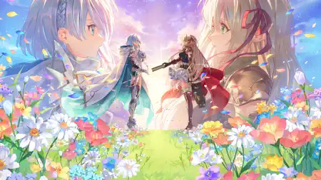
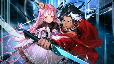
Sampled from 5 of Shadowverse: Worlds Beyond's App Store screenshots — background, accent and theme, measured by LaunchShots (not something Apple publishes).
#5C9CE4 bg
#5089C8
#2C546C accent
#111111 text
Screenshots


Icon palette
About this app
Cygamesが贈る新作カードゲーム『Shadowverse: Worlds Beyond』がついに始動! 「超進化」や「パーク機能」をはじめとする新要素・新コンテンツが加わり 新たな次元のスマホカードゲームに! 『Shadowverse』をプレイしている方も、初めてプレイする方も さらに進化したシャドウバースを体験しよう! ■カードバトル シャドウバースはシンプルなルールながら戦略は無限大! カードの組み合わせやプレイの駆け引きがカードゲームの勝敗を左右する! 美しいイラストで彩られる白熱のバトルを体験しよう! ■新システム「超進化」 すべてのフォロワー(場に出して戦うカード)はバトル中に「超進化」できる! 「超進化」したフォロワーはでかくなって、攻撃時に相手のフォロワーを吹っ飛ばしてリーダーにぶつけることが可能に! 「超進化」で戦局を大きく変えるパワーを手に入れて、戦略的かつ爽快感のあるカードバトルを楽しもう! ■毎日カードパック無料 毎日カードパックが無料で引ける! カードを集めるだけで楽しめる「カード図鑑」も登場! バトルだけでなくコレ…
App details
What you can learn from Shadowverse: Worlds Beyond
Every shipping app on the App Store has gone through the same decisions you're working through right now: which screenshot goes first, what caption sits over it, which device frame to show, what color the background should be. The 5 screenshots above are Shadowverse: Worlds Beyond's answers to those questions — they're public, they're real, and they made it through Apple's review.
What the numbers say: Shadowverse: Worlds Beyond runs a mixed light-and-dark set where the background shifts from screenshot to screenshot (first shot #5C9CE4) — each image has to stand on its own, so the captions carry more of the story. The accent colour we picked up, #2C546C, is the one to reuse for badges, arrows and highlighted words if you borrow this look. Hit Use this style to open the editor with these exact colours and drop your own screenshot in.
Notice the first screenshot in particular. It's the one users see in search results and on the product page, and it's where most apps spend their best caption and tightest design. Look at the proportion of background to phone, where the text sits, what one thing the image is trying to communicate.
Want to see how other Games apps approach the same problem? Browse more Games apps in the showcase.
Take what works into your own screenshots
Open LaunchShots and design your App Store & Google Play screenshots — pick a device frame, drop captions, ship in minutes. Free, in your browser.
Open the screenshot editor →Apps with a similar look
Closest background + accent colours among the listings we've analysed — useful when you want to see the same palette handled by a different team.