Chart position — tracked daily by LaunchShots
Screenshot style breakdown
Sampled from 6 of Холодильник Организовать 3D's App Store screenshots — background, accent and theme, measured by LaunchShots (not something Apple publishes).
#FCD4A4 bg
#DDBA90
#444474 accent
#111111 text
Screenshots


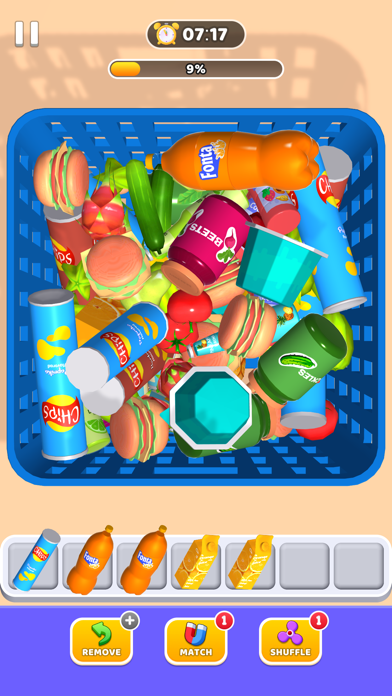


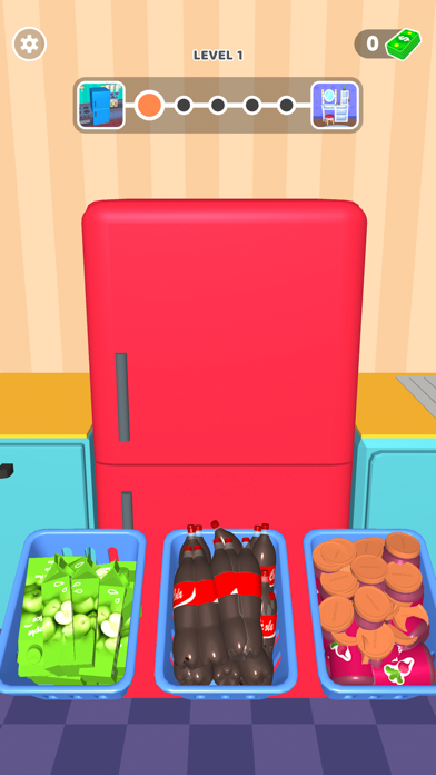
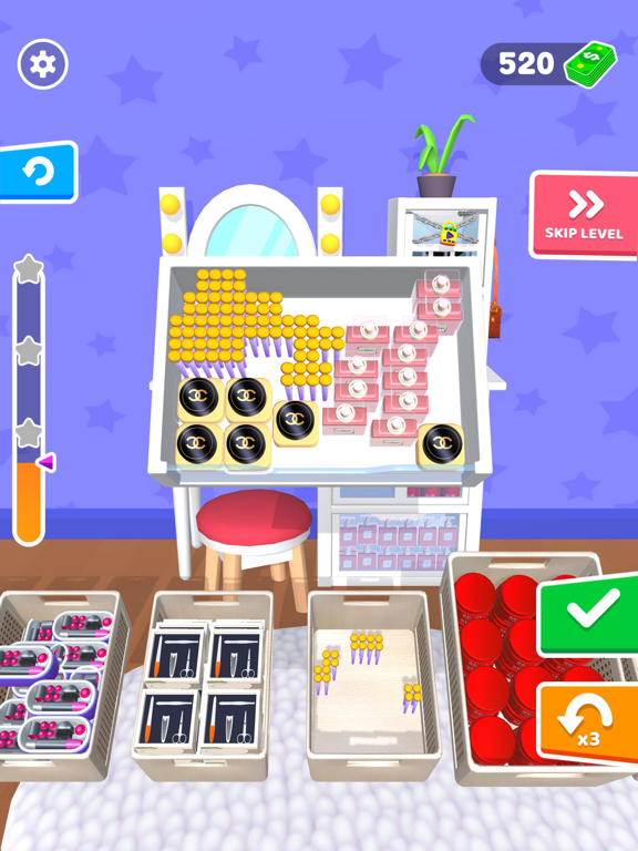
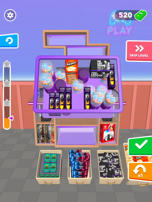
iPad screenshots




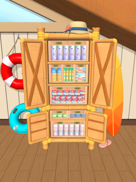
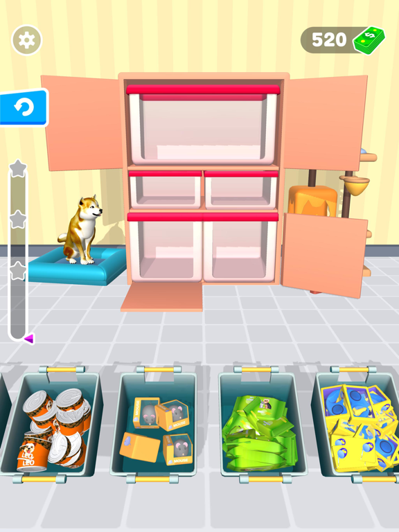
Icon palette
About this app
Игры на организацию и хранение — Давайте заполним холодильник! Простая и понятная механика — любой сможет быстро начать игру и приступить к организации. Мы также добавили новый режим мини-игры, чтобы сделать процесс ещё веселее и увлекательнее! Испытайте удовлетворение от наведения порядка — почти как в реальной жизни. Получите удовольствие от организации повседневных предметов в реалистичной домашней обстановке. Аккуратно размещайте закуски и напитки в холодильнике, раскладывайте косметику и аксессуары на туалетном столике, упорядочивайте средства гигиены в ванной и складывайте одежду в корзины для белья. Просто нажимайте и перетаскивайте, чтобы выполнять действия — и наслаждайтесь уютом идеально организованного пространства. Открывайте вкусные продукты и другие сюрпризы — по мере прохождения уровней вы разблокируете аппетитные блюда, полезные органайзеры и множество интересных п…
App details
What you can learn from Холодильник Организовать 3D
Every shipping app on the App Store has gone through the same decisions you're working through right now: which screenshot goes first, what caption sits over it, which device frame to show, what color the background should be. The 15 screenshots above are Холодильник Организовать 3D's answers to those questions — they're public, they're real, and they made it through Apple's review.
What the numbers say: Холодильник Организовать 3D runs a light set where the background shifts from screenshot to screenshot (first shot #FCD4A4) — each image has to stand on its own, so the captions carry more of the story. The accent colour we picked up, #444474, is the one to reuse for badges, arrows and highlighted words if you borrow this look. Hit Use this style to open the editor with these exact colours and drop your own screenshot in.
Notice the first screenshot in particular. It's the one users see in search results and on the product page, and it's where most apps spend their best caption and tightest design. Look at the proportion of background to phone, where the text sits, what one thing the image is trying to communicate.
Want to see how other Games apps approach the same problem? Browse more Games apps in the showcase.
Take what works into your own screenshots
Open LaunchShots and design your App Store & Google Play screenshots — pick a device frame, drop captions, ship in minutes. Free, in your browser.
Open the screenshot editor →Apps with a similar look
Closest background + accent colours among the listings we've analysed — useful when you want to see the same palette handled by a different team.