Chart position — tracked daily by LaunchShots
Screenshot style breakdown
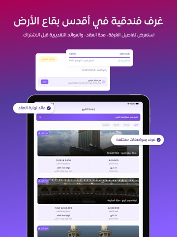
Sampled from 4 of موتيلز's App Store screenshots — background, accent and theme, measured by LaunchShots (not something Apple publishes).
#8C64FC bg
#9C79FC
#342464 accent
#FFFFFF text
Screenshots


iPad screenshots



Icon palette
About this app
موتيلز — منصة إعادة التأجير الفندقي تُشغِّل شركة المساكن الاقتصادية للخدمات العقارية، المرخَّصة والمسجَّلة في المملكة العربية السعودية، منصة موتيلز بوصفها منصة لإعادة التأجير الفندقي، تعمل وفق الأنظمة واللوائح المعمول بها في المملكة، وتلتزم بمعايير الشفافية التعاقدية في توضيح حقوق المستأجرين المنتفعين والتزاماتهم. تتيح منصة موتيلز شراء حق الانتفاع بوحدات فندقية مختارة في أبرز الوجهات الفندقية في المملكة، والمشاركة في صافي عوائد تأجيرها الفعلي عند انتهاء مدة العقد، من خلال عقد شراء حق الانتفاع والمشاركة في عوائده، وهو عقد موثَّق ومراجع شرعياً من جهة استشارة شرعية مستقلة معتمدة. يقوم النموذج التشغيلي للمنصة على اختيار الوحدة الفندقية، وسداد قيمة الانتفاع لمدة زمنية معلومة، ثم توقيع عقد شراء حق الانتفاع إلكترونياً عبر منصة نفاذ المعتمدة حكومياً. ويُرمَّز العقد فور توقيعه توثيقاً تقنياً على البلوكتشين بما يضمن سلامته وعدم قابليته للتعديل. تتولى شركة المساكن الاقتصادية إدارة التأجير الفع…
App details
What you can learn from موتيلز
Every shipping app on the App Store has gone through the same decisions you're working through right now: which screenshot goes first, what caption sits over it, which device frame to show, what color the background should be. The 8 screenshots above are موتيلز's answers to those questions — they're public, they're real, and they made it through Apple's review.
What the numbers say: موتيلز runs a mixed light-and-dark set where the background shifts from screenshot to screenshot (first shot #8C64FC) — each image has to stand on its own, so the captions carry more of the story. The accent colour we picked up, #342464, is the one to reuse for badges, arrows and highlighted words if you borrow this look. Hit Use this style to open the editor with these exact colours and drop your own screenshot in.
Notice the first screenshot in particular. It's the one users see in search results and on the product page, and it's where most apps spend their best caption and tightest design. Look at the proportion of background to phone, where the text sits, what one thing the image is trying to communicate.
Want to see how other Business apps approach the same problem? Browse more Business apps in the showcase.
Take what works into your own screenshots
Open LaunchShots and design your App Store & Google Play screenshots — pick a device frame, drop captions, ship in minutes. Free, in your browser.
Open the screenshot editor →Apps with a similar look
Closest background + accent colours among the listings we've analysed — useful when you want to see the same palette handled by a different team.