Chart position — tracked daily by LaunchShots
Screenshot style breakdown
Sampled from 6 of Vプリカ+'s App Store screenshots — background, accent and theme, measured by LaunchShots (not something Apple publishes).
#E4F4FC bg
#C8D6DD
#048CCC accent
#111111 text
Reading the caption text from the screenshots in your browser…
Screenshots



Icon palette
About this app
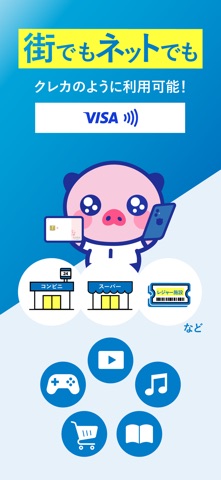
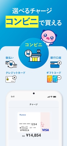
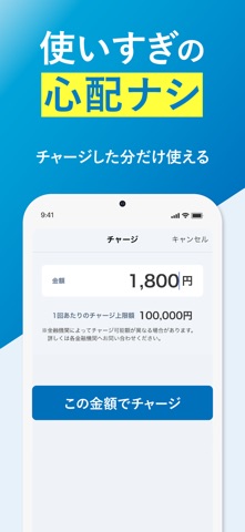
【Vプリカとは】 審査なし・本人確認不要で誰でも作れるVisaプリペイドカードアプリです。 簡単な登録のみで最短3分で発行。クレジットカードがなくてもネット決済できるVisaカードとして使えます。 コンビニ・銀行口座・後払いなど多彩なチャージ方法。入会費・年会費無料。 ※Vプリカギフト(Visaギフトカード)をもらった方は、このアプリでギフト登録・チャージができます 【こんな方におすすめ】 ・クレジットカードを持てない・作りたくない方 ・審査なしですぐ使えるVisaカードが欲しい方 ・ネットショッピングやゲーム課金用のカードが欲しい方 ・後払いでチャージできるプリペイドカードを探している方 ・使いすぎ防止のためチャージ式カードを使いたい方 ・学生・未成年でもVisaカードを使いたい方(親権者同意要) ・後払いができるプリペイドアプリをお探しの方 【使えるお店・サービス】 ・Amazon、楽天、ALIEXPRESS、メルカリ、Qoo10、SHEIN、 アプリ課金、ゲーム課金、PlayStation Store、pixiv など ・PayPay・Suicaなど電子マネーへのチャージ ・Ne…
App details
What you can learn from Vプリカ+
Every shipping app on the App Store has gone through the same decisions you're working through right now: which screenshot goes first, what caption sits over it, which device frame to show, what color the background should be. The 6 screenshots above are Vプリカ+'s answers to those questions — they're public, they're real, and they made it through Apple's review.
What the numbers say: Vプリカ+ runs a light set with one background colour (#E4F4FC) carried across every screenshot — the listing reads as a single poster when the shots sit side by side in search results. The accent colour we picked up, #048CCC, is the one to reuse for badges, arrows and highlighted words if you borrow this look. Hit Use this style to open the editor with these exact colours and drop your own screenshot in.
Notice the first screenshot in particular. It's the one users see in search results and on the product page, and it's where most apps spend their best caption and tightest design. Look at the proportion of background to phone, where the text sits, what one thing the image is trying to communicate.
Want to see how other Finance apps approach the same problem? Browse more Finance apps in the showcase.
Take what works into your own screenshots
Open LaunchShots and design your App Store & Google Play screenshots — pick a device frame, drop captions, ship in minutes. Free, in your browser.
Open the screenshot editor →Apps with a similar look
Closest background + accent colours among the listings we've analysed — useful when you want to see the same palette handled by a different team.