Chart position — tracked daily by LaunchShots
Screenshot changes — detected by LaunchShots
Screenshot style breakdown
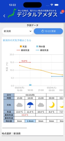
Sampled from 6 of デジタルアメダス's App Store screenshots — background, accent and theme, measured by LaunchShots (not something Apple publishes).
#ECECEC bg
#CFCFCF
#4C8CEC accent
#111111 text
Screenshots




iPad screenshots


Icon palette
About this app
このアプリについて 【アプリの概要】 気象庁は、アメダスや衛星データ等を用いて面的に解析した気象データから任意の地点の気象データを把握可能とする取組を「デジタルアメダス」と呼んで面的データの利活用促進に取り組んでいます。このアプリは、気象庁が提供する面的データの利活用状況やニーズを把握し、更なる利便性の向上を図ることを目的として、令和6年4月から北海道向けに公開し、令和7年4月からは全国に展開しているものです。 【ご利用上のお願い】 アプリトップページの「ご意見・ご要望はこちら」から、面的データのニーズ等に関するご意見を利用者の皆様から募集していますのでご協力をお願いします。また、面的データをどのような方がどのような目的で利用されているか分析するため、利用者の皆様の年齢、性別、居住地域、利用目的などの登録をお願いしています。予めご了承ください。 【プライバシーポリシー】 当アプリの運用にあたり、法律に基づいて個人情報を適正に取り扱うために、以下のポリシーを守り、個人情報の保護に努めます。 (1)…
App details
What you can learn from デジタルアメダス
Every shipping app on the App Store has gone through the same decisions you're working through right now: which screenshot goes first, what caption sits over it, which device frame to show, what color the background should be. The 18 screenshots above are デジタルアメダス's answers to those questions — they're public, they're real, and they made it through Apple's review.
What the numbers say: デジタルアメダス runs a mixed light-and-dark set where the background shifts from screenshot to screenshot (first shot #ECECEC) — each image has to stand on its own, so the captions carry more of the story. The accent colour we picked up, #4C8CEC, is the one to reuse for badges, arrows and highlighted words if you borrow this look. Hit Use this style to open the editor with these exact colours and drop your own screenshot in.
Notice the first screenshot in particular. It's the one users see in search results and on the product page, and it's where most apps spend their best caption and tightest design. Look at the proportion of background to phone, where the text sits, what one thing the image is trying to communicate.
Want to see how other Weather apps approach the same problem? Browse more Weather apps in the showcase.
Take what works into your own screenshots
Open LaunchShots and design your App Store & Google Play screenshots — pick a device frame, drop captions, ship in minutes. Free, in your browser.
Open the screenshot editor →Apps with a similar look
Closest background + accent colours among the listings we've analysed — useful when you want to see the same palette handled by a different team.