Chart position — tracked daily by LaunchShots
Screenshot style breakdown
Sampled from 5 of 爱听外语's App Store screenshots — background, accent and theme, measured by LaunchShots (not something Apple publishes).
#FC6C2C bg
#FC8049
#8C44FC accent
#FFFFFF text
Screenshots
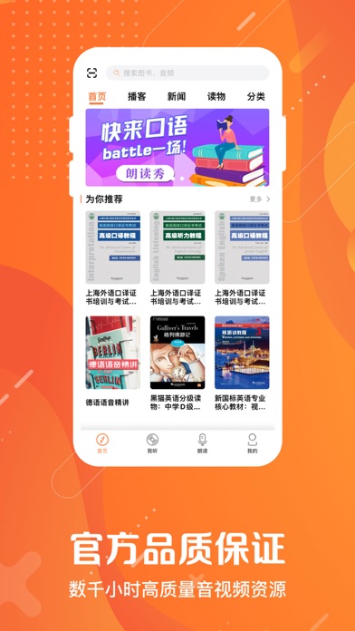


iPad screenshots


Icon palette
About this app
上海外语教育出版社旗下的爱听外语,是以外语爱好者为中心,拥有各大高校学生资源的外语服务平台! 海量优质书籍、超清配音、QR二维码扫描书籍、精致视觉交互...尽在爱听外语! 【主要功能】 1、利用QR二维码技术,实现图书与对应在线音频资源的互动; 2、超全图书资源,涵盖英语、德语、法语、西班牙语等八大语言; 3、超清配音,每个音频都拥有专业外语配音员为你朗读; 4、全新音频配套字幕,满足你听外语、学外语的各种需求; 使用中遇到任何问题,请通过“我的资料” - “设置” - “意见反馈”告诉我们,我们会尽快与你联系! 也可通过以下方式,与我们联系: QQ群:606710436 网站:http://audio.sflep.com 微博:http://e.weibo.com/sflepdcenter 技术支持:service@sflep.com 上海外语教育出版社有限公司出品 上海外教社信息技术有限公司制作 ©上海外语教育出版社有限公司 2026 版权所有 翻版必究
App details
What you can learn from 爱听外语
Every shipping app on the App Store has gone through the same decisions you're working through right now: which screenshot goes first, what caption sits over it, which device frame to show, what color the background should be. The 10 screenshots above are 爱听外语's answers to those questions — they're public, they're real, and they made it through Apple's review.
What the numbers say: 爱听外语 runs a dark set with one background colour (#FC6C2C) carried across every screenshot — the listing reads as a single poster when the shots sit side by side in search results. The accent colour we picked up, #8C44FC, is the one to reuse for badges, arrows and highlighted words if you borrow this look. Hit Use this style to open the editor with these exact colours and drop your own screenshot in.
Notice the first screenshot in particular. It's the one users see in search results and on the product page, and it's where most apps spend their best caption and tightest design. Look at the proportion of background to phone, where the text sits, what one thing the image is trying to communicate.
Want to see how other Education apps approach the same problem? Browse more Education apps in the showcase.
Take what works into your own screenshots
Open LaunchShots and design your App Store & Google Play screenshots — pick a device frame, drop captions, ship in minutes. Free, in your browser.
Open the screenshot editor →Apps with a similar look
Closest background + accent colours among the listings we've analysed — useful when you want to see the same palette handled by a different team.