Chart position — tracked daily by LaunchShots
Screenshot changes — detected by LaunchShots
Screenshot style breakdown
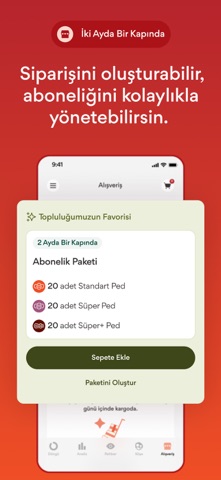
Sampled from 6 of beije: Regl & Döngü Takvimi's App Store screenshots — background, accent and theme, measured by LaunchShots (not something Apple publishes).
#ECECEC bg
#CFCFCF
#AC141C accent
#111111 text
Screenshots




Icon palette
About this app
Reklamsız · Ücretsiz · Güvenli Döngü Takibi beije App; bedenini, ritmini ve regl (menstrüel) döngünü daha yakından tanıman ve keşfetmen için tasarlanmış, tamamen Türkçe, güvenli ve ücretsiz bir regl takip uygulaması. Gizli ödeme duvarları (paywall) ya da reklamlar olmadan sen de yüz binlerce kullanıcı gibi döngünü, fizyolojik ve zihinsel değişimlerini hiç bölünmeden takip edebilirsin. Menstrüasyon ve ovülasyon gibi tüm fazların en doğru tahminlerle anında öğren! Öne Çıkan Özellikler Takvim Regl başlangıç ve bitiş tarihlerini saniyeler içinde kaydet. Tüm geçmiş döngülerini tek ekranda incele, yaklaşan regl ve yumurtlama tarihlerini takvim üzerinden anında gör. Yüksek tahmin oranıyla sonraki aylarda regl olacağın tarihleri öğren. Yaşadığın semptomları, belirtileri, akıntı yoğunluğunu, akıntı rengini ve ruh hâlini kolayca not et. Döngü Analizi Paylaştığın veriler doğrultusunda sana …
App details
What you can learn from beije: Regl & Döngü Takvimi
Every shipping app on the App Store has gone through the same decisions you're working through right now: which screenshot goes first, what caption sits over it, which device frame to show, what color the background should be. The 8 screenshots above are beije: Regl & Döngü Takvimi's answers to those questions — they're public, they're real, and they made it through Apple's review.
What the numbers say: beije: Regl & Döngü Takvimi runs a mixed light-and-dark set where the background shifts from screenshot to screenshot (first shot #ECECEC) — each image has to stand on its own, so the captions carry more of the story. The accent colour we picked up, #AC141C, is the one to reuse for badges, arrows and highlighted words if you borrow this look. Hit Use this style to open the editor with these exact colours and drop your own screenshot in.
Notice the first screenshot in particular. It's the one users see in search results and on the product page, and it's where most apps spend their best caption and tightest design. Look at the proportion of background to phone, where the text sits, what one thing the image is trying to communicate.
Want to see how other Health & Fitness apps approach the same problem? Browse more Health & Fitness apps in the showcase.
Take what works into your own screenshots
Open LaunchShots and design your App Store & Google Play screenshots — pick a device frame, drop captions, ship in minutes. Free, in your browser.
Open the screenshot editor →Apps with a similar look
Closest background + accent colours among the listings we've analysed — useful when you want to see the same palette handled by a different team.