Chart position — tracked daily by LaunchShots
Screenshot changes — detected by LaunchShots
Screenshot style breakdown
Sampled from 5 of Verkehrsguru - Theorie-App's App Store screenshots — background, accent and theme, measured by LaunchShots (not something Apple publishes).
#0C142C bg
#2E3449
#348C34 accent
#FFFFFF text
Screenshots


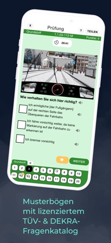

iPad screenshots

Icon palette
About this app
VerkehrsGuru Theorie-App: für dich entwickelt, damit du deine Prüfung easy bestehst. Warum VerkehrsGuru? 1. TÜV- & DEKRA-lizenzierter Fragenkatalog Immer die neuesten, echten Prüfungsfragen – genau so, wie sie in deiner Theorieprüfung drankommen. Keine Überraschungen, keine veralteten Inhalte. 2. Original-Prüfungsoberfläche Du lernst in der App genau wie später in der Prüfung – keine bösen Überraschungen am Prüfungstag! 3. Mündliche Erklärungen zu jeder Frage Vergiss stumpfes Auswendiglernen: Wir erklären dir alles verständlich, so oft du willst. Als säße dein Lehrer neben dir! 4. Moderne Animationen & Visuals Endlich verstehen, was im Verkehr passiert – grafisch auf den Punkt gebracht. 5. Prüfungssimulationen & Lernstandsanzeige Teste dich so oft du willst, tracke deinen Fortschritt – bis du ready bist. Wer versteht, der besteht. Mit VerkehrsGuru. Lade dir jetzt die VerkehrsG…
App details
What you can learn from Verkehrsguru - Theorie-App
Every shipping app on the App Store has gone through the same decisions you're working through right now: which screenshot goes first, what caption sits over it, which device frame to show, what color the background should be. The 6 screenshots above are Verkehrsguru - Theorie-App's answers to those questions — they're public, they're real, and they made it through Apple's review.
What the numbers say: Verkehrsguru - Theorie-App runs a dark set with one background colour (#0C142C) carried across every screenshot — the listing reads as a single poster when the shots sit side by side in search results. The accent colour we picked up, #348C34, is the one to reuse for badges, arrows and highlighted words if you borrow this look. Hit Use this style to open the editor with these exact colours and drop your own screenshot in.
Notice the first screenshot in particular. It's the one users see in search results and on the product page, and it's where most apps spend their best caption and tightest design. Look at the proportion of background to phone, where the text sits, what one thing the image is trying to communicate.
Want to see how other Education apps approach the same problem? Browse more Education apps in the showcase.
Take what works into your own screenshots
Open LaunchShots and design your App Store & Google Play screenshots — pick a device frame, drop captions, ship in minutes. Free, in your browser.
Open the screenshot editor →Apps with a similar look
Closest background + accent colours among the listings we've analysed — useful when you want to see the same palette handled by a different team.