Chart position — tracked daily by LaunchShots
Screenshot style breakdown
Sampled from 6 of 妈妈的口袋-宝贝出行穿着指南's App Store screenshots — background, accent and theme, measured by LaunchShots (not something Apple publishes).
#FCFCFC bg
#DDDDDD
#FC5C54 accent
#111111 text
Screenshots




iPad screenshots


Icon palette
About this app
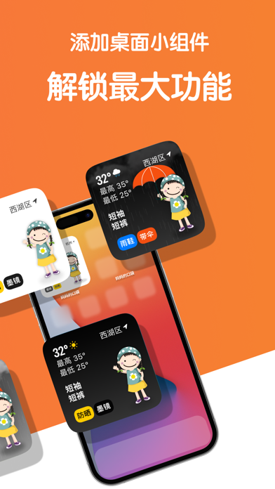
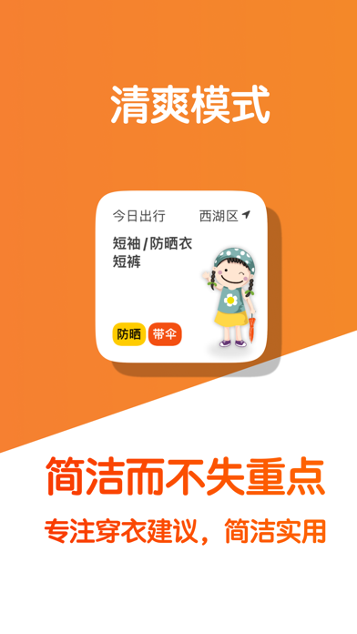
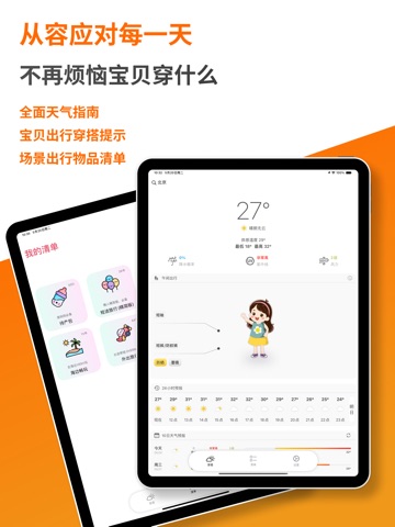
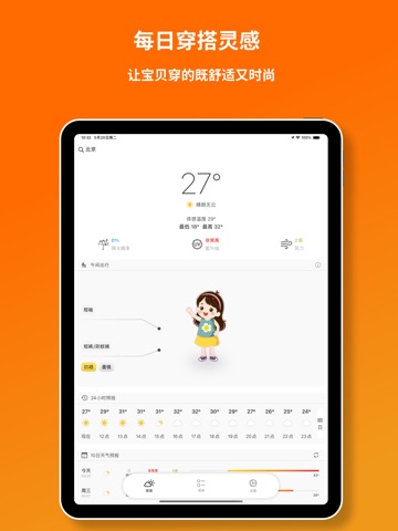
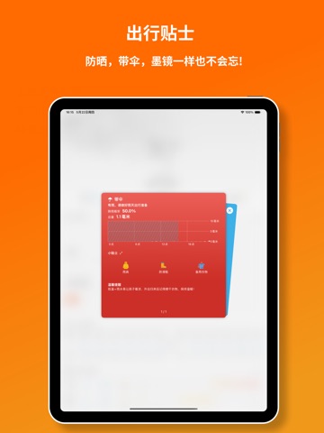
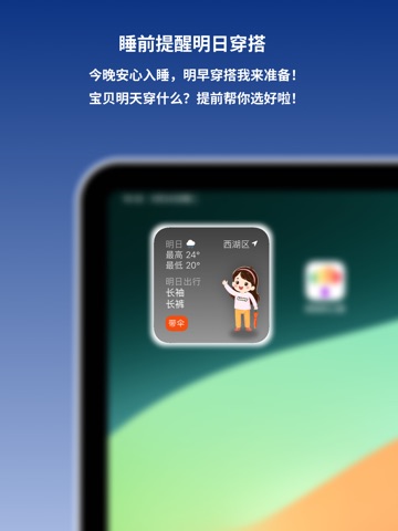
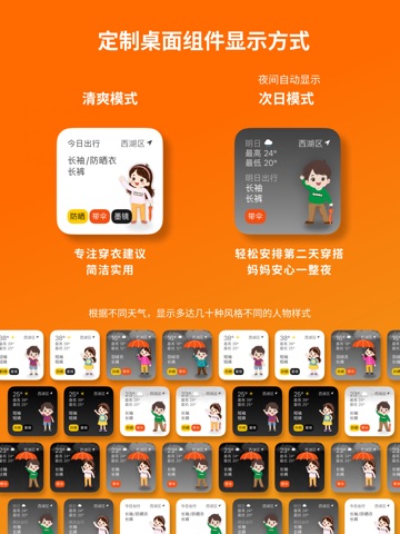
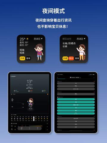
****为爱心父母量身定制的智能宝贝出行助手**** "妈妈的口袋"是一款专为宝贝父母设计的应用,旨在通过精准的天气预报和贴心的穿衣建议,帮助父母们更好地照顾他们的宝贝。 无论是晴天、雨天还是紫外线强烈的日子,这款应用都会为您提供最合适的外出穿衣建议,让宝贝每天都能舒适出行。 我们同时为宝爸宝妈们按场景整理了宝贝出行物品清单,每次出行都有准备,物品不再遗漏! **主要功能** ”每日天气预报“:每晚提供次日详细天气预报,包括温度、降水概率和紫外线强度,让您提前做好准备。 “穿衣建议”:根据天气情况,提供专业的穿衣建议,包括是否需要雨具、防晒用品等,确保宝贝无论何时何地都能穿着得当。 “出行物品清单”:根据出行场景,例如:日常休闲遛娃,海边玩沙子,短途长途旅行,节假日露营等等,为宝爸宝妈列出出行物品清单,确保出行不遗漏物品! ”手绘儿童形象“:精美的手绘儿童形象为宝贝打扮提供灵感,让每天的穿衣搭配都充满乐趣和创意。 “桌面小组件”:无需打开应用,即可通过桌面小组件随时掌握天气和宝贝穿衣建议,方便快捷。 ”高清动态天气效果…
App details
What you can learn from 妈妈的口袋-宝贝出行穿着指南
Every shipping app on the App Store has gone through the same decisions you're working through right now: which screenshot goes first, what caption sits over it, which device frame to show, what color the background should be. The 18 screenshots above are 妈妈的口袋-宝贝出行穿着指南's answers to those questions — they're public, they're real, and they made it through Apple's review.
What the numbers say: 妈妈的口袋-宝贝出行穿着指南 runs a light set where the background shifts from screenshot to screenshot (first shot #FCFCFC) — each image has to stand on its own, so the captions carry more of the story. The accent colour we picked up, #FC5C54, is the one to reuse for badges, arrows and highlighted words if you borrow this look. Hit Use this style to open the editor with these exact colours and drop your own screenshot in.
Notice the first screenshot in particular. It's the one users see in search results and on the product page, and it's where most apps spend their best caption and tightest design. Look at the proportion of background to phone, where the text sits, what one thing the image is trying to communicate.
Want to see how other Weather apps approach the same problem? Browse more Weather apps in the showcase.
Take what works into your own screenshots
Open LaunchShots and design your App Store & Google Play screenshots — pick a device frame, drop captions, ship in minutes. Free, in your browser.
Open the screenshot editor →Apps with a similar look
Closest background + accent colours among the listings we've analysed — useful when you want to see the same palette handled by a different team.