Chart position — tracked daily by LaunchShots
Screenshot style breakdown
Sampled from 4 of Определить Грибы по фото: Гриб's App Store screenshots — background, accent and theme, measured by LaunchShots (not something Apple publishes).
#7C9454 bg
#8EA26B
#445C1C accent
#FFFFFF text
Reading the caption text from the screenshots in your browser…
Screenshots
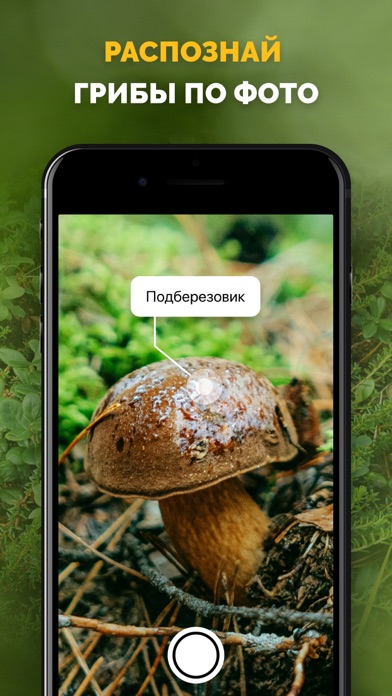
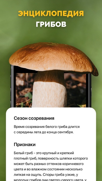


iPad screenshots


Icon palette
About this app
Ваш незаменимый помощник в мире грибов! Это инновационное мобильное приложение, которое использует передовые технологии распознавания изображений и искусственного интеллекта, чтобы помочь вам быстро и точно идентифицировать грибы в дикой природе. Приложение поможет вам: 1. **Мгновенно распознать грибы Просто сделайте фото гриба, и приложение мгновенно предоставит вам информацию о его виде, съедобности и других важных характеристиках. 2. Получить доступ к Обширной базе данных Приложение содержит обширную базу данных с описаниями, фотографиями и научными названиями тысяч видов грибов со всего мира. 3. Получить советы по сбору Узнайте, где и когда лучше всего искать грибы, а также получите полезные советы по их сбору и обработке. 4. Вести личный журнал Ведите собственный журнал находок, добавляйте заметки и фотографии, чтобы отслеживать свои успехи и делиться ими с друзьями. • Подпи…
App details
What you can learn from Определить Грибы по фото: Гриб
Every shipping app on the App Store has gone through the same decisions you're working through right now: which screenshot goes first, what caption sits over it, which device frame to show, what color the background should be. The 8 screenshots above are Определить Грибы по фото: Гриб's answers to those questions — they're public, they're real, and they made it through Apple's review.
What the numbers say: Определить Грибы по фото: Гриб runs a mixed light-and-dark set where the background shifts from screenshot to screenshot (first shot #7C9454) — each image has to stand on its own, so the captions carry more of the story. The accent colour we picked up, #445C1C, is the one to reuse for badges, arrows and highlighted words if you borrow this look. Hit Use this style to open the editor with these exact colours and drop your own screenshot in.
Notice the first screenshot in particular. It's the one users see in search results and on the product page, and it's where most apps spend their best caption and tightest design. Look at the proportion of background to phone, where the text sits, what one thing the image is trying to communicate.
Want to see how other Reference apps approach the same problem? Browse more Reference apps in the showcase.
Take what works into your own screenshots
Open LaunchShots and design your App Store & Google Play screenshots — pick a device frame, drop captions, ship in minutes. Free, in your browser.
Open the screenshot editor →Apps with a similar look
Closest background + accent colours among the listings we've analysed — useful when you want to see the same palette handled by a different team.