Screenshot style breakdown
Sampled from 6 of Ziare.com's App Store screenshots — background, accent and theme, measured by LaunchShots (not something Apple publishes).
#045494 bg
#276BA2
#6C9CC4 accent
#FFFFFF text
Screenshots
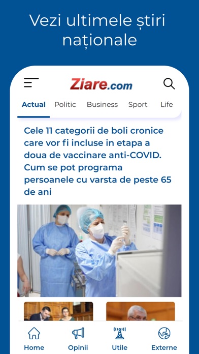
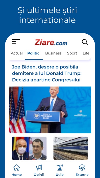


iPad screenshots


Icon palette
About this app
RO: Toate stirile care conteaza, intr-un singur loc Aplicatia Ziare.com iti aduce pe iPhone cel mai interesant flux de stiri din presa interna si internationala, actualizat minut cu minut, 24 din 24 de ore, 7 zile din 7. Navighezi simplu si usor prin sute de stiri si informatii utile de pe Ziare.com, citesti articole in exclusivitate si afli mereu primul ce se intampla. Acum poti sa vezi continut foto si video si poti sa dai share pe Facebook si Twitter. Instaleaza gratuit aplicatia si primesti pe telefon: - doar stirile care te intereseaza - alerte de vreme extrema - toate ziarele de top, la un loc - stiri din orasul tau - notificari de breaking news - starea drumurilor in orice moment - cursul valutar BNR, meteo si horoscop Pentru sugestii si comentarii ne puteti scrie pe adresa: mobileapp@ziare.com EN: News that really matters Ziare.com app brings to your iPhone the most inter…
App details
What you can learn from Ziare.com
Every shipping app on the App Store has gone through the same decisions you're working through right now: which screenshot goes first, what caption sits over it, which device frame to show, what color the background should be. The 8 screenshots above are Ziare.com's answers to those questions — they're public, they're real, and they made it through Apple's review.
What the numbers say: Ziare.com runs a dark set with one background colour (#045494) carried across every screenshot — the listing reads as a single poster when the shots sit side by side in search results. The accent colour we picked up, #6C9CC4, is the one to reuse for badges, arrows and highlighted words if you borrow this look. Hit Use this style to open the editor with these exact colours and drop your own screenshot in.
Notice the first screenshot in particular. It's the one users see in search results and on the product page, and it's where most apps spend their best caption and tightest design. Look at the proportion of background to phone, where the text sits, what one thing the image is trying to communicate.
Want to see how other News apps approach the same problem? Browse more News apps in the showcase.
Take what works into your own screenshots
Open LaunchShots and design your App Store & Google Play screenshots — pick a device frame, drop captions, ship in minutes. Free, in your browser.
Open the screenshot editor →Apps with a similar look
Closest background + accent colours among the listings we've analysed — useful when you want to see the same palette handled by a different team.