Chart position — tracked daily by LaunchShots
Screenshot style breakdown
Sampled from 5 of Дома для Майнкрафт's App Store screenshots — background, accent and theme, measured by LaunchShots (not something Apple publishes).
#6CC4EC bg
#5FACCF
#54841C accent
#111111 text
Screenshots

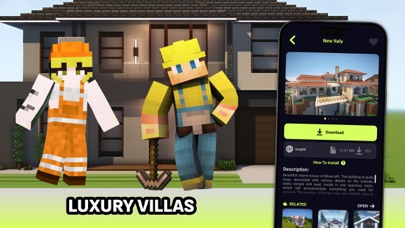
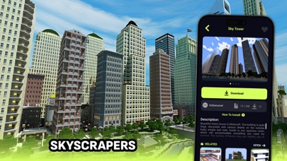

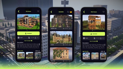
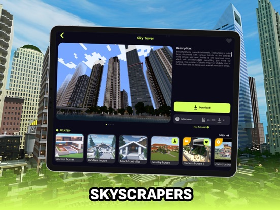
iPad screenshots


Icon palette
About this app
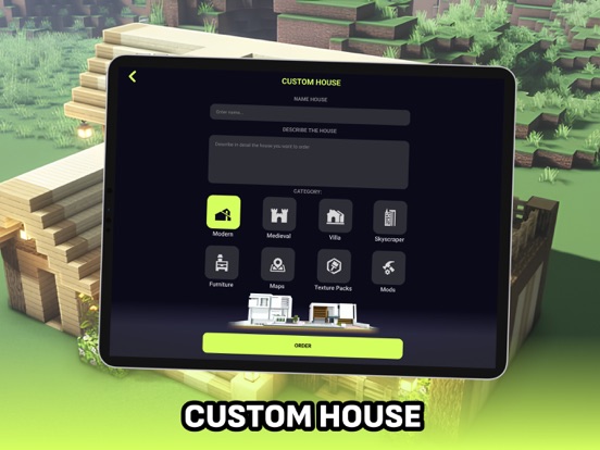
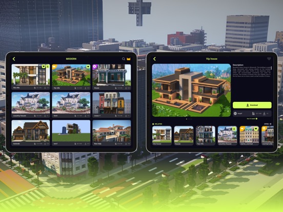
Buildings for Minecraft — ваш надежный помощник в создании уникальных построек для Minecraft! С нашим уникальным каталогом вы можете загружать и интегрировать разнообразные дома прямо в свою любимую игру, обеспечивая легкий доступ ко многим архитектурным стилям. Наш каталог предлагает широкий выбор домов для загрузки в вашу игру, включая современные дома, средневековые здания, городские здания и небоскребы, виллы, а также дома для девочек и мальчиков. Вы можете легко загрузить и добавить в игру свои любимые постройки. Не нашли дом, который искали? Закажите его! В нашем приложении вы можете заказать уникальный дом по собственному описанию у наших разработчиков. Вы можете подробно описать свой идеальный дом, и наши разработчики создадут его специально для вас. Если нам понравится ваша идея, ваш дом будет добавлен в каталог, чтобы вы и другие пользователи могли загрузить его и наслаждат…
App details
What you can learn from Дома для Майнкрафт
Every shipping app on the App Store has gone through the same decisions you're working through right now: which screenshot goes first, what caption sits over it, which device frame to show, what color the background should be. The 10 screenshots above are Дома для Майнкрафт's answers to those questions — they're public, they're real, and they made it through Apple's review.
What the numbers say: Дома для Майнкрафт runs a mixed light-and-dark set where the background shifts from screenshot to screenshot (first shot #6CC4EC) — each image has to stand on its own, so the captions carry more of the story. The accent colour we picked up, #54841C, is the one to reuse for badges, arrows and highlighted words if you borrow this look. Hit Use this style to open the editor with these exact colours and drop your own screenshot in.
Notice the first screenshot in particular. It's the one users see in search results and on the product page, and it's where most apps spend their best caption and tightest design. Look at the proportion of background to phone, where the text sits, what one thing the image is trying to communicate.
Want to see how other Entertainment apps approach the same problem? Browse more Entertainment apps in the showcase.
Take what works into your own screenshots
Open LaunchShots and design your App Store & Google Play screenshots — pick a device frame, drop captions, ship in minutes. Free, in your browser.
Open the screenshot editor →Apps with a similar look
Closest background + accent colours among the listings we've analysed — useful when you want to see the same palette handled by a different team.