Chart position — tracked daily by LaunchShots
Screenshot style breakdown
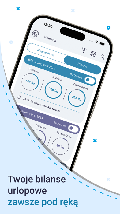
Sampled from 5 of mPracownik Pro's App Store screenshots — background, accent and theme, measured by LaunchShots (not something Apple publishes).
#FCFCFC bg
#DDDDDD
#049CDC accent
#111111 text
Reading the caption text from the screenshots in your browser…
Screenshots




iPad screenshots


Icon palette
About this app
mPracownik Pro – Twoje mobilne biuro w kieszeni! Wyobraź sobie świat, w którym zarządzanie zasobami ludzkimi jest proste, intuicyjne i efektywne. Gdzie każdy pracownik ma natychmiastowy dostęp do swoich danych, harmonogramów i dokumentów, a wszelkie formalności są załatwiane jednym dotknięciem ekranu. Poznaj mPracownik Pro – aplikację, która rewolucjonizuje sposób, w jaki pracujemy! mPracownik Pro to coś więcej niż narzędzie – to wszechstronne rozwiązanie, które wprowadza nową jakość do zarządzania kadrami i płacami. Dzięki pełnej integracji z systemem SIMPLE.ERP, mPracownik Pro zapewnia płynność i bezpieczeństwo przepływu danych, minimalizując ryzyko błędów i oszczędzając czas. Teraz możesz skupić się na tym, co naprawdę ważne – rozwijaniu swojej firmy i dbaniu o zadowolenie zespołu. Kluczowe funkcje mPracownik Pro: • Dostęp do danych kadrowych i płacowych – Przeglądaj dane osobowe, p…
App details
What you can learn from mPracownik Pro
Every shipping app on the App Store has gone through the same decisions you're working through right now: which screenshot goes first, what caption sits over it, which device frame to show, what color the background should be. The 8 screenshots above are mPracownik Pro's answers to those questions — they're public, they're real, and they made it through Apple's review.
What the numbers say: mPracownik Pro runs a mixed light-and-dark set where the background shifts from screenshot to screenshot (first shot #FCFCFC) — each image has to stand on its own, so the captions carry more of the story. The accent colour we picked up, #049CDC, is the one to reuse for badges, arrows and highlighted words if you borrow this look. Hit Use this style to open the editor with these exact colours and drop your own screenshot in.
Notice the first screenshot in particular. It's the one users see in search results and on the product page, and it's where most apps spend their best caption and tightest design. Look at the proportion of background to phone, where the text sits, what one thing the image is trying to communicate.
Want to see how other Business apps approach the same problem? Browse more Business apps in the showcase.
Take what works into your own screenshots
Open LaunchShots and design your App Store & Google Play screenshots — pick a device frame, drop captions, ship in minutes. Free, in your browser.
Open the screenshot editor →Apps with a similar look
Closest background + accent colours among the listings we've analysed — useful when you want to see the same palette handled by a different team.