Screenshot style breakdown
Sampled from 4 of ClinPeer's App Store screenshots — background, accent and theme, measured by LaunchShots (not something Apple publishes).
#0C244C bg
#2E4265
#4C648C accent
#FFFFFF text
Screenshots
Icon palette
About this app
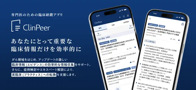
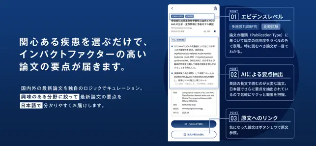
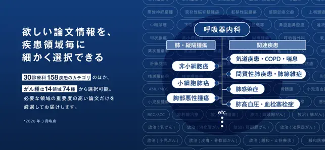
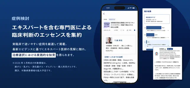
ClinPeerは、最新論文の要点を日本語で効率的に把握し、 論文解説や症例検討を通じてエキスパートの視点を深く学べるサービスです。 忙しい医師の臨床研鑽をサポートします。 ◆論文キュレーション 疾患やがん種を登録することで、その領域の最新論文が毎日自動でキュレーションされ、日本語で要点を抽出・翻訳されて届きます。 ・30診療科158疾患、14領域74種のがん種ごとに、検索式やジャーナルの重みづけなどの配信ロジックを設計。 ・エキスパート医師による検索式の監修により、臨床において重要な論文が適切に届きます。 ◆医師論文解説 毎日配信される最新論文の中から重要なものをピックアップし、論文概要とともに知っておくべきポイントをエキスパート医師が解説します。 単なる情報収集に留まらない、深い理解を提供します。 ◆症例検討サービス がん専門医が「治療選択に迷う症例」を症例化し、他医師の選択・理由を可視化・構造化することで、臨床現場での意思決定を補強する治療方針支援サービスとして「症例検討」機能を提供しています。 また、…
App details
What you can learn from ClinPeer
Every shipping app on the App Store has gone through the same decisions you're working through right now: which screenshot goes first, what caption sits over it, which device frame to show, what color the background should be. The 4 screenshots above are ClinPeer's answers to those questions — they're public, they're real, and they made it through Apple's review.
What the numbers say: ClinPeer runs a dark set with one background colour (#0C244C) carried across every screenshot — the listing reads as a single poster when the shots sit side by side in search results. The accent colour we picked up, #4C648C, is the one to reuse for badges, arrows and highlighted words if you borrow this look. Hit Use this style to open the editor with these exact colours and drop your own screenshot in.
Notice the first screenshot in particular. It's the one users see in search results and on the product page, and it's where most apps spend their best caption and tightest design. Look at the proportion of background to phone, where the text sits, what one thing the image is trying to communicate.
Want to see how other Medical apps approach the same problem? Browse more Medical apps in the showcase.
Take what works into your own screenshots
Open LaunchShots and design your App Store & Google Play screenshots — pick a device frame, drop captions, ship in minutes. Free, in your browser.
Open the screenshot editor →Apps with a similar look
Closest background + accent colours among the listings we've analysed — useful when you want to see the same palette handled by a different team.