Chart position — tracked daily by LaunchShots
Screenshot style breakdown
Sampled from 6 of アウトドア天気's App Store screenshots — background, accent and theme, measured by LaunchShots (not something Apple publishes).
#64A4C4 bg
#5890AC
#FC6404 accent
#111111 text
Screenshots

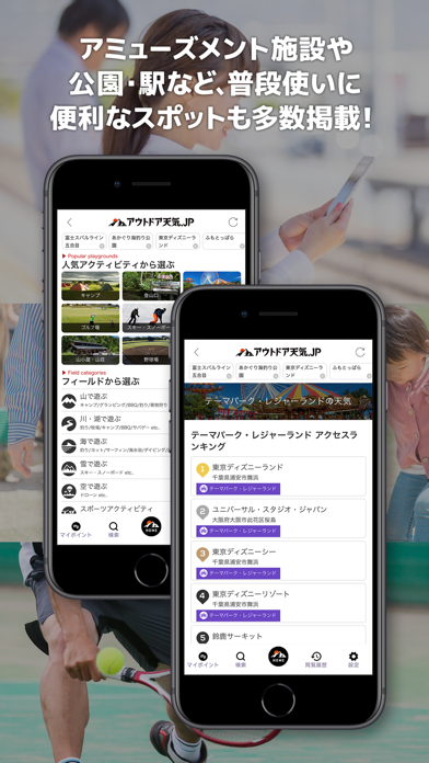


iPad screenshots


Icon palette
About this app
「アウトドア天気.jp」は無料で使える天気予報アプリです。 アウトドアシーンのみならず、日常の生活でも便利に使える理由は、全国最多ポイント数のピンポイント気象データを保有し、最長14日間先までの天気予報を提供している点にあります。 ピンポイントの1時間ごとの天気予報は、降水のタイミングや風向風速などの変化を見る事により、各アウトドアアクティビティに活かせる上、日常生活においても、その日の行動、服装、持ち物などにも役立てられます。 ◆全国各地のアウトドアスポット、駅や学校、病院などを含むランドマーク約28万箇所のピンポイント天気予報を提供します。 ◆ピンポイント毎の1時間時系天気予報を84時間先まで表示します。 ◆更に3時間毎の天気予報を14日間先まで表示しています。 ◆外出時に気になる雨雲・雷の動きを、動画にてビジュアル再生できます。 ◆広域エリアの風向、風速、気温、降水量などの、気象庁観測の実測データを地図上に再現します。 ◆海遊びでは必須の潮汐データをわかりやすいグラフで表示します。 ◆スポット沖合の波高、波向…
App details
What you can learn from アウトドア天気
Every shipping app on the App Store has gone through the same decisions you're working through right now: which screenshot goes first, what caption sits over it, which device frame to show, what color the background should be. The 12 screenshots above are アウトドア天気's answers to those questions — they're public, they're real, and they made it through Apple's review.
What the numbers say: アウトドア天気 runs a mixed light-and-dark set where the background shifts from screenshot to screenshot (first shot #64A4C4) — each image has to stand on its own, so the captions carry more of the story. The accent colour we picked up, #FC6404, is the one to reuse for badges, arrows and highlighted words if you borrow this look. Hit Use this style to open the editor with these exact colours and drop your own screenshot in.
Notice the first screenshot in particular. It's the one users see in search results and on the product page, and it's where most apps spend their best caption and tightest design. Look at the proportion of background to phone, where the text sits, what one thing the image is trying to communicate.
Want to see how other Weather apps approach the same problem? Browse more Weather apps in the showcase.
Take what works into your own screenshots
Open LaunchShots and design your App Store & Google Play screenshots — pick a device frame, drop captions, ship in minutes. Free, in your browser.
Open the screenshot editor →Apps with a similar look
Closest background + accent colours among the listings we've analysed — useful when you want to see the same palette handled by a different team.