Chart position — tracked daily by LaunchShots
Screenshot style breakdown
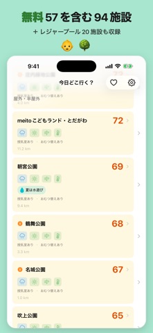
Sampled from 6 of 今日どこ行く?'s App Store screenshots — background, accent and theme, measured by LaunchShots (not something Apple publishes).
#B4ECF4 bg
#9ECFD6
#2C743C accent
#111111 text
Screenshots



Icon palette
About this app
朝10秒で、今日の行き先が決まる。天気・UV・風・気温を100点満点で判定。名古屋近郊の公園・屋内施設・レジャープールから、今日いちばん安全な場所がすぐわかる。 【こんな経験ありませんか?】 - 朝、天気アプリとUVアプリを何度も行ったり来たり - 「今日の風、子どもに大丈夫かな...」と不安になる - 週末の公園予定が天気で崩れて、慌てて代わりを探す - 気づけばいつも同じ公園ばかり 【今日どこ行く?が解決します】 ◆ 気象安全スコア (100点満点) 天気・UV指数・風速・気温の4指標をリアルタイムで統合。 公園ごとの安全性が一目でわかります。 ◆ 名古屋近郊100施設以上を一覧比較 公園・屋内施設・レジャープールを、スコア順に並べて比較。 雨や暑さなどで外遊びが難しい施設は、見送り候補に分けて表示します。 ◆ 夏はレジャープールにも対応 近場のレジャープールも、家からの距離・お子さまの 年齢・その日の天候で「今日行けるプール」がわかります。 ◆ 訪問履歴でスコアが変わる 最近行った公園のスコアは自動的に下がるから、 新しい公園との出…
App details
What you can learn from 今日どこ行く?
Every shipping app on the App Store has gone through the same decisions you're working through right now: which screenshot goes first, what caption sits over it, which device frame to show, what color the background should be. The 6 screenshots above are 今日どこ行く?'s answers to those questions — they're public, they're real, and they made it through Apple's review.
What the numbers say: 今日どこ行く? runs a light set where the background shifts from screenshot to screenshot (first shot #B4ECF4) — each image has to stand on its own, so the captions carry more of the story. The accent colour we picked up, #2C743C, is the one to reuse for badges, arrows and highlighted words if you borrow this look. Hit Use this style to open the editor with these exact colours and drop your own screenshot in.
Notice the first screenshot in particular. It's the one users see in search results and on the product page, and it's where most apps spend their best caption and tightest design. Look at the proportion of background to phone, where the text sits, what one thing the image is trying to communicate.
Want to see how other Weather apps approach the same problem? Browse more Weather apps in the showcase.
Take what works into your own screenshots
Open LaunchShots and design your App Store & Google Play screenshots — pick a device frame, drop captions, ship in minutes. Free, in your browser.
Open the screenshot editor →Apps with a similar look
Closest background + accent colours among the listings we've analysed — useful when you want to see the same palette handled by a different team.