Chart position — tracked daily by LaunchShots
Screenshot style breakdown
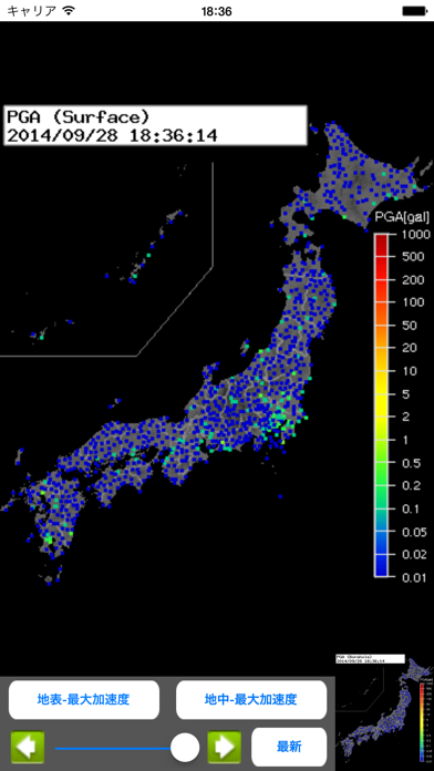
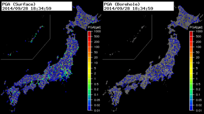
Sampled from 2 of 強震モニタビューワー's App Store screenshots — background, accent and theme, measured by LaunchShots (not something Apple publishes).
#040404 bg
#272727
#0404D4 accent
#FFFFFF text
- #1PGA (Surface)
Captions read from the screenshots (OCR, may contain small errors): 1 headline, 2 words on average (longest 2).
Screenshots
iPad screenshots


Icon palette
About this app
独立行政法人防災科学技術研究所の強震モニタの情報を確認することができるサードパーティアプリです。 URL等決め打ちにしてるところがあるため、サイトの仕様変更で見られなくなる可能性があります。 設定アプリから設定画面に入ることができます。 設定できる項目は、 ・スリープ無効設定 ・背景地図、白/黒/外観モード連動(iOS13以上)選択 ・縦画面時及び横画面時左側マップの種類設定 ・横画面時右側マップの種類設定 ・強震モニタサイトデータ取得オフセット時間 ※サーバーの処理が重くなって白地図が頻繁に表示される場合に調整して見て下さい(例:-4秒 ー> -6秒) ・強震モニタサーバーの選択 通知設定は設定アプリの通知項目より行なって下さい。 通知はEEWとAQUAシステムの地震検知をもとに送信されます。主にEEWの通知になりますが、震源深さ50km以上でM4くらいの地震ではAQUAからの通知になる場合があります。その際は予測震度が表示されません。 縦画面表示時に以下の操作が可能です。 ・左下ボタンにて、縦画面時及び横画面時左側マップの種類…
App details
What you can learn from 強震モニタビューワー
Every shipping app on the App Store has gone through the same decisions you're working through right now: which screenshot goes first, what caption sits over it, which device frame to show, what color the background should be. The 4 screenshots above are 強震モニタビューワー's answers to those questions — they're public, they're real, and they made it through Apple's review.
What the numbers say: 強震モニタビューワー runs a dark set with one background colour (#040404) carried across every screenshot — the listing reads as a single poster when the shots sit side by side in search results. The accent colour we picked up, #0404D4, is the one to reuse for badges, arrows and highlighted words if you borrow this look. Hit Use this style to open the editor with these exact colours and drop your own screenshot in.
Notice the first screenshot in particular. It's the one users see in search results and on the product page, and it's where most apps spend their best caption and tightest design. Look at the proportion of background to phone, where the text sits, what one thing the image is trying to communicate.
Want to see how other Weather apps approach the same problem? Browse more Weather apps in the showcase.
Take what works into your own screenshots
Open LaunchShots and design your App Store & Google Play screenshots — pick a device frame, drop captions, ship in minutes. Free, in your browser.
Open the screenshot editor →Apps with a similar look
Closest background + accent colours among the listings we've analysed — useful when you want to see the same palette handled by a different team.