Chart position — tracked daily by LaunchShots
Screenshot changes — detected by LaunchShots
Screenshot style breakdown
Sampled from 6 of Dirk Supermarkt's App Store screenshots — background, accent and theme, measured by LaunchShots (not something Apple publishes).
#E40414 bg
#E72734
#5CCCFC accent
#FFFFFF text
- #1Bekijk de heste van Nederland! ; Dirk
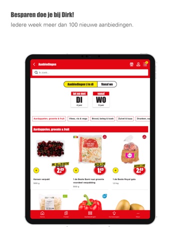
- #3Besparen doe je bij Dirk! ledere week meer dan 100 nieuwe aanbiedingen.
- #4Folder De beste aanbiedingen vind je in de folder van Dirk!
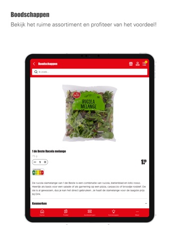
- #5Boodschappen Bekijk het ruime assortiment en profiteer van het voordeel!
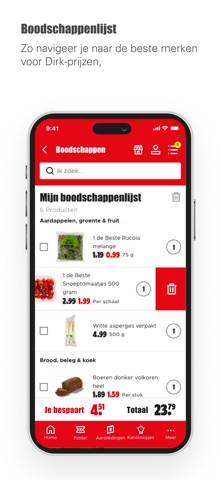
- #6Bekijk per afdeling alle boodschappen. Zo navigeer je naar de beste merken
Captions read from the screenshots (OCR, may contain small errors): 5 headlines, 10.4 words on average (longest 12).
Screenshots




iPad screenshots




Icon palette
About this app
Alle voordelen op een rij: - Mis geen aanbiedingen of Kanskoopjes Je vindt bij Dirk altijd de beste weekaanbiedingen vanaf woensdag. Wil je weten welke acties er volgende week zijn? Dan zie je vanaf vrijdag alle aanbiedingen van de week erop. Ook vind je elke zondag nieuwe Kanskoopjes. Wees er snel bij, want OP=OP! - Digitale folder bij de hand Wil je snel alle aanbiedingen doorbladeren? Dan heb je de digitale folder altijd bij de hand in de App. Vanaf vrijdag blader je ook alvast door de nieuwe folder. - Boodschappenlijst maken Maak snel en gemakkelijk je boodschappenlijst en streep de producten af. Zo loop je de winkel uit met alle boodschappen in de kar. Wanneer je inlogt in de App, deel je gemakkelijk de boodschappenlijst met je partner, familie of huisgenoot. Pas je iets aan de lijst aan? Dan is het direct voor iedereen zichtbaar. Klaar met de lijst? Verwijder hem dan of sla hem…
App details
What you can learn from Dirk Supermarkt
Every shipping app on the App Store has gone through the same decisions you're working through right now: which screenshot goes first, what caption sits over it, which device frame to show, what color the background should be. The 17 screenshots above are Dirk Supermarkt's answers to those questions — they're public, they're real, and they made it through Apple's review.
What the numbers say: Dirk Supermarkt runs a mixed light-and-dark set where the background shifts from screenshot to screenshot (first shot #E40414) — each image has to stand on its own, so the captions carry more of the story. The accent colour we picked up, #5CCCFC, is the one to reuse for badges, arrows and highlighted words if you borrow this look. Hit Use this style to open the editor with these exact colours and drop your own screenshot in.
Notice the first screenshot in particular. It's the one users see in search results and on the product page, and it's where most apps spend their best caption and tightest design. Look at the proportion of background to phone, where the text sits, what one thing the image is trying to communicate.
Want to see how other Food & Drink apps approach the same problem? Browse more Food & Drink apps in the showcase.
Take what works into your own screenshots
Open LaunchShots and design your App Store & Google Play screenshots — pick a device frame, drop captions, ship in minutes. Free, in your browser.
Open the screenshot editor →Apps with a similar look
Closest background + accent colours among the listings we've analysed — useful when you want to see the same palette handled by a different team.