Screenshot changes — detected by LaunchShots
Screenshot style breakdown
Sampled from 6 of ハローキティ:マイドリームストア's App Store screenshots — background, accent and theme, measured by LaunchShots (not something Apple publishes).
#9CDCFC bg
#89C1DD
#6C5484 accent
#111111 text
Screenshots


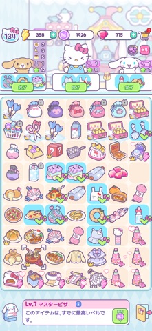


iPad screenshots


Icon palette
About this app
みんなが遊びに来なくなり、廃れてしまったショッピングタウンを見て悲しむハローキティとクロミ。 ここはもう、みんなのための夢の空間ではなくなってしまいました。 でも、このまま諦めるわけにはいきません!可愛いサンリオキャラクターズとパズルをマージして、特別なショッピングタウンを作りましょう。 ショッピングタウンにキラキラした夢と笑顔を取り戻しましょう!サンリオキャラクターズと一緒なら、不可能はありません 『Hello Kitty My Dream Store』の特徴: ◎ 可愛いと可愛いをマージ - パズルをマージすると、さらにキュートなサンリオパズルが登場! - マージミッションをクリアし続けて、さらにたくさんのサンリオキャラクターズとパズルを楽しみましょう! ◎ ショッピングタウンを修理して拡張 - ハローキティとクロミを手伝って廃れてしまったショッピングタウンを修理し、様々なストアを作りましょう! - 夢と希望のショッピングタウンを取り戻す旅を描いた、心温まるストーリー! ◎ 自分だけのストアをカスタマイズして運営 - サン…
App details
What you can learn from ハローキティ:マイドリームストア
Every shipping app on the App Store has gone through the same decisions you're working through right now: which screenshot goes first, what caption sits over it, which device frame to show, what color the background should be. The 16 screenshots above are ハローキティ:マイドリームストア's answers to those questions — they're public, they're real, and they made it through Apple's review.
What the numbers say: ハローキティ:マイドリームストア runs a light set where the background shifts from screenshot to screenshot (first shot #9CDCFC) — each image has to stand on its own, so the captions carry more of the story. The accent colour we picked up, #6C5484, is the one to reuse for badges, arrows and highlighted words if you borrow this look. Hit Use this style to open the editor with these exact colours and drop your own screenshot in.
Notice the first screenshot in particular. It's the one users see in search results and on the product page, and it's where most apps spend their best caption and tightest design. Look at the proportion of background to phone, where the text sits, what one thing the image is trying to communicate.
Want to see how other Games apps approach the same problem? Browse more Games apps in the showcase.
Take what works into your own screenshots
Open LaunchShots and design your App Store & Google Play screenshots — pick a device frame, drop captions, ship in minutes. Free, in your browser.
Open the screenshot editor →Apps with a similar look
Closest background + accent colours among the listings we've analysed — useful when you want to see the same palette handled by a different team.