Chart position — tracked daily by LaunchShots
Screenshot changes — detected by LaunchShots
Screenshot style breakdown
Sampled from 6 of Merge Restyle's App Store screenshots — background, accent and theme, measured by LaunchShots (not something Apple publishes).
#2C74C4 bg
#4987CC
#6CBCF4 accent
#FFFFFF text
Screenshots
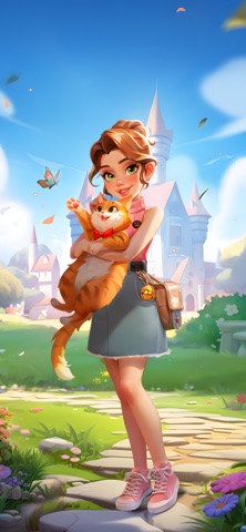


iPad screenshots
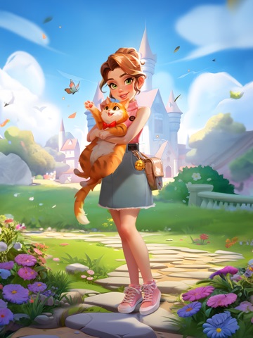
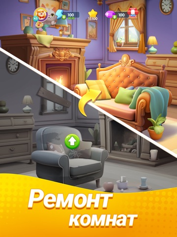


Icon palette
About this app
Добро пожаловать в Merge Restyle – Идеальное Слияние Дизайна Дома и Компании Питомца! Готовы ли вы стать легендарным мастером дизайна? Мечтаете ли вы превратить ветхий дом и город в современный рай? В Merge Restyle вам не придется выбирать! Присоединяйтесь к нам в одной из самых захватывающих игр со слиянием на рынке. Merge Restyle — это не просто еще одна головоломка; это творческое путешествие, где домашний дизайн сочетается с увлекательностью игр с питомцами. Здесь вы будете комбинировать предметы, составлять пары инструментов и открывать секреты красивой жизни. Являетесь ли вы поклонником игр на совпадение или просто любите декорировать и преображать, эта игра идеально вам подходит! ОСОБЕННОСТИ ИГРЫ СЛИЯНИЕ И СОВПАДЕНИЕ ДЛЯ СОЗДАНИЯ Основа игры проста, но приносит глубокое удовлетворение. Забудьте о стрессовых таймерах; здесь вы можете расслабиться. Просто перетаскивайте и объеди…
App details
What you can learn from Merge Restyle
Every shipping app on the App Store has gone through the same decisions you're working through right now: which screenshot goes first, what caption sits over it, which device frame to show, what color the background should be. The 12 screenshots above are Merge Restyle's answers to those questions — they're public, they're real, and they made it through Apple's review.
What the numbers say: Merge Restyle runs a mixed light-and-dark set where the background shifts from screenshot to screenshot (first shot #2C74C4) — each image has to stand on its own, so the captions carry more of the story. The accent colour we picked up, #6CBCF4, is the one to reuse for badges, arrows and highlighted words if you borrow this look. Hit Use this style to open the editor with these exact colours and drop your own screenshot in.
Notice the first screenshot in particular. It's the one users see in search results and on the product page, and it's where most apps spend their best caption and tightest design. Look at the proportion of background to phone, where the text sits, what one thing the image is trying to communicate.
Want to see how other Games apps approach the same problem? Browse more Games apps in the showcase.
Take what works into your own screenshots
Open LaunchShots and design your App Store & Google Play screenshots — pick a device frame, drop captions, ship in minutes. Free, in your browser.
Open the screenshot editor →Apps with a similar look
Closest background + accent colours among the listings we've analysed — useful when you want to see the same palette handled by a different team.