Chart position — tracked daily by LaunchShots
Screenshot style breakdown
Sampled from 6 of Folo - RSS-ридер с ИИ's App Store screenshots — background, accent and theme, measured by LaunchShots (not something Apple publishes).
#ECE4DC bg
#CFC8C1
#FC5C04 accent
#111111 text
Screenshots


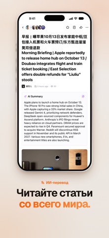


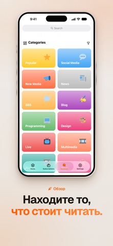


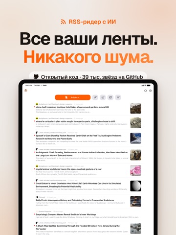
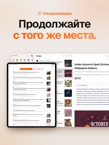
iPad screenshots



Icon palette
About this app
Folo — это RSS-ридер с ИИ. Он собирает всё, на что вы подписаны, в одну аккуратную ленту и помогает в ней разобраться. Блоги, новостные сайты, рассылки, подкасты, видеоканалы и соцсети — в одном месте. ИИ перескажет длинные статьи, переведёт тексты на других языках и прочитает остальное вслух, чтобы вы оставались в курсе и не тонули во вкладках. ВСЕ ПОДПИСКИ В ОДНОЙ ЛЕНТЕ • Подписывайтесь на любые ленты RSS, Atom и JSON Feed или ищите источники по названию • Следите за сайтами без RSS через тысячи маршрутов RSSHub • Находите новые любимые источники среди популярных лент и подборок • Перенесите подписки из любого другого ридера через OPML • Наводите порядок с помощью папок, избранного и списков ИИ, КОТОРЫЙ ЧИТАЕТ ВМЕСТЕ С ВАМИ • ИИ-пересказ: главное из любой статьи за секунды • ИИ-перевод на английский, китайский, японский или французский, рядом с оригиналом или отдельно • Чтение вслу…
App details
What you can learn from Folo - RSS-ридер с ИИ
Every shipping app on the App Store has gone through the same decisions you're working through right now: which screenshot goes first, what caption sits over it, which device frame to show, what color the background should be. The 16 screenshots above are Folo - RSS-ридер с ИИ's answers to those questions — they're public, they're real, and they made it through Apple's review.
What the numbers say: Folo - RSS-ридер с ИИ runs a mixed light-and-dark set where the background shifts from screenshot to screenshot (first shot #ECE4DC) — each image has to stand on its own, so the captions carry more of the story. The accent colour we picked up, #FC5C04, is the one to reuse for badges, arrows and highlighted words if you borrow this look. Hit Use this style to open the editor with these exact colours and drop your own screenshot in.
Notice the first screenshot in particular. It's the one users see in search results and on the product page, and it's where most apps spend their best caption and tightest design. Look at the proportion of background to phone, where the text sits, what one thing the image is trying to communicate.
Want to see how other News apps approach the same problem? Browse more News apps in the showcase.
Take what works into your own screenshots
Open LaunchShots and design your App Store & Google Play screenshots — pick a device frame, drop captions, ship in minutes. Free, in your browser.
Open the screenshot editor →Apps with a similar look
Closest background + accent colours among the listings we've analysed — useful when you want to see the same palette handled by a different team.