Chart position — tracked daily by LaunchShots
Screenshot changes — detected by LaunchShots
Screenshot style breakdown
Sampled from 6 of DewsLife's App Store screenshots — background, accent and theme, measured by LaunchShots (not something Apple publishes).
#040404 bg
#272727
#D41C1C accent
#FFFFFF text
Screenshots
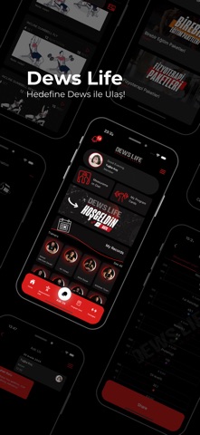

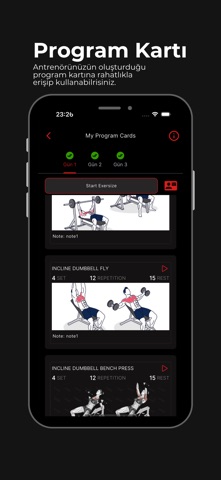



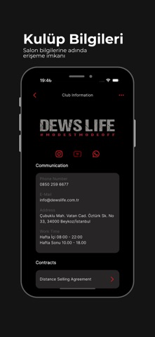
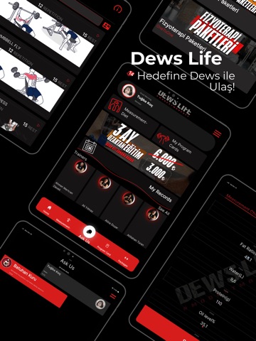
iPad screenshots
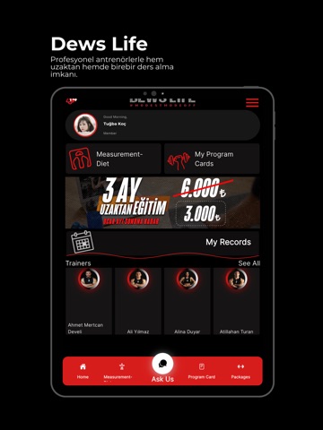


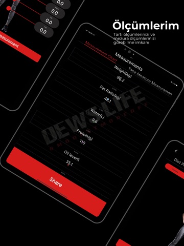

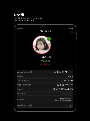

Icon palette
About this app
DewsLife, sağlıklı yaşam ve fitness hedeflerinize ulaşmak için en kapsamlı çözüm. DewsLife tarafından geliştirilen bu uygulama, her seviyedeki kullanıcıya uygun uzaktan ve birebir ders seçenekleri sunar. Kendi ihtiyaçlarınıza göre özelleştirilmiş eğitimlerle, daha sağlıklı bir yaşam için adım atın! * Uzaktan Eğitim : Dews ile, eğitmeninizin hazırladığı kişisel egzersiz planlarını evinizin rahatlığında takip edebilirsiniz. Anlık geri bildirimler alarak, sağlıklı yaşam yolculuğunuzu destekleyin. * Birebir Eğitim : Yüz yüze dersler ile hedeflerinize daha hızlı ulaşın. Dews’te, eğitmeninizle doğrudan iletişim kurarak özel dersler alabilir, ilerlemenizi yakından takip edebilirsiniz. Ders için onay kodu oluşturulacak ve ders alacağınız eğitmeni seçmeniz gerekecek. * Ödeme Seçenekleri: Birebir derslerde ödeme işlemi havale veya kredi kartı ile yapılabilir. Yüksek tutarlı paketlerde ise parçalı…
App details
What you can learn from DewsLife
Every shipping app on the App Store has gone through the same decisions you're working through right now: which screenshot goes first, what caption sits over it, which device frame to show, what color the background should be. The 16 screenshots above are DewsLife's answers to those questions — they're public, they're real, and they made it through Apple's review.
What the numbers say: DewsLife runs a dark set with one background colour (#040404) carried across every screenshot — the listing reads as a single poster when the shots sit side by side in search results. The accent colour we picked up, #D41C1C, is the one to reuse for badges, arrows and highlighted words if you borrow this look. Hit Use this style to open the editor with these exact colours and drop your own screenshot in.
Notice the first screenshot in particular. It's the one users see in search results and on the product page, and it's where most apps spend their best caption and tightest design. Look at the proportion of background to phone, where the text sits, what one thing the image is trying to communicate.
Want to see how other Sports apps approach the same problem? Browse more Sports apps in the showcase.
Take what works into your own screenshots
Open LaunchShots and design your App Store & Google Play screenshots — pick a device frame, drop captions, ship in minutes. Free, in your browser.
Open the screenshot editor →Apps with a similar look
Closest background + accent colours among the listings we've analysed — useful when you want to see the same palette handled by a different team.