Screenshot style breakdown
Sampled from 5 of Talk.AI's App Store screenshots — background, accent and theme, measured by LaunchShots (not something Apple publishes).
#040404 bg
#272727
#8C5C4C accent
#FFFFFF text
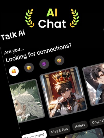
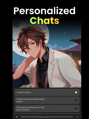
- #1. N stomps snow off his boots Okay, I'm officially done with winter.
- #3stomps snow off his boots Okay, I'm officially done with winter. @ Whose idea was it to ta
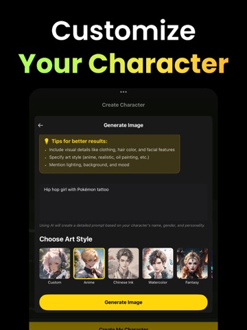
- #4Add an image to use f hat A “X Al Helper Tall black hair anime guy O Try Again
- #5Maya 03122025 Wihatif told you Ive been waiting fo the perfect moment to kiss you? Tonight
Captions read from the screenshots (OCR, may contain small errors): 4 headlines, 16.5 words on average (longest 19).
Screenshots


iPad screenshots



Icon palette
About this app
Talk Ai is a powerful and engaging app that lets you create and chat with unique AI-powered characters. Whether you want to tell stories, roleplay, or simply connect with fascinating personalities, Talk Ai makes it fun and easy to bring your imagination to life. Design your characters with customizable traits, start meaningful or entertaining conversations, and dive into an immersive chat experience—no technical expertise required. Talk Ai advanced AI ensures fluid and responsive interactions, making each conversation feel natural and engaging. From creative storytelling to stress-free chatting, Talk Ai opens the door to endless possibilities. Build your dream character lineup, share your creations, or explore an ever-growing community of characters designed by others. Payment Information: * Payments are deducted from your iTunes account upon confirmation. * Subscriptions renew automat…
App details
What you can learn from Talk.AI
Every shipping app on the App Store has gone through the same decisions you're working through right now: which screenshot goes first, what caption sits over it, which device frame to show, what color the background should be. The 12 screenshots above are Talk.AI's answers to those questions — they're public, they're real, and they made it through Apple's review.
What the numbers say: Talk.AI runs a dark set with one background colour (#040404) carried across every screenshot — the listing reads as a single poster when the shots sit side by side in search results. The accent colour we picked up, #8C5C4C, is the one to reuse for badges, arrows and highlighted words if you borrow this look. Hit Use this style to open the editor with these exact colours and drop your own screenshot in.
Notice the first screenshot in particular. It's the one users see in search results and on the product page, and it's where most apps spend their best caption and tightest design. Look at the proportion of background to phone, where the text sits, what one thing the image is trying to communicate.
Want to see how other Entertainment apps approach the same problem? Browse more Entertainment apps in the showcase.
Take what works into your own screenshots
Open LaunchShots and design your App Store & Google Play screenshots — pick a device frame, drop captions, ship in minutes. Free, in your browser.
Open the screenshot editor →Apps with a similar look
Closest background + accent colours among the listings we've analysed — useful when you want to see the same palette handled by a different team.