Chart position — tracked daily by LaunchShots
Screenshot style breakdown
Sampled from 6 of ハローワーク求人検索アプリ's App Store screenshots — background, accent and theme, measured by LaunchShots (not something Apple publishes).
#34CC5C bg
#2DB350
#FC8404 accent
#111111 text
Screenshots


iPad screenshots




Icon palette
About this app
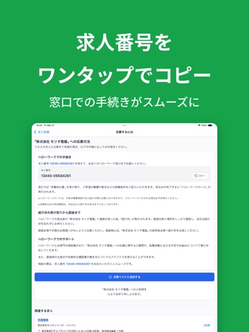
全国のハローワークが提供する公式求人や一般求人を、24時間365日、いつでもどこでも無料で検索・閲覧できるアプリです。 煩雑な会員登録は一切不要。シンプルな操作画面と高機能検索で、あなたの就職・転職活動を力強くサポートします。 ■ 主な機能 検索機能 ・キーワード検索(職種/会社名/資格など) ・勤務地検索(都道府県・市区町村単位) 求人詳細の閲覧 ・ハローワーク求人番号、仕事内容、労働条件(賃金形態・通勤手当・就業時間) ・選考フロー、応募方法 ・会社情報(従業員数・設立年・事業内容) ・勤務地確認 ブックマーク・検索条件保存 ・検索条件を保存し、ワンタップで再検索 ・検討リストに追加した求人は一覧管理。ハローワーク窓口で求人番号を提示してスムーズに紹介依頼 ■ 応募の流れ ・アプリで求人詳細画面から求人番号をメモまたは検討リストに保存 ・最寄りのハローワーク窓口で紹介申請 ・ハローワーク職員に求人番号を提示し、応募手続き完了 ※ 応募にはハローワークを通じた紹介が必要です。 ■ こんなお悩みをお持ちではな…
App details
What you can learn from ハローワーク求人検索アプリ
Every shipping app on the App Store has gone through the same decisions you're working through right now: which screenshot goes first, what caption sits over it, which device frame to show, what color the background should be. The 13 screenshots above are ハローワーク求人検索アプリ's answers to those questions — they're public, they're real, and they made it through Apple's review.
What the numbers say: ハローワーク求人検索アプリ runs a light set where the background shifts from screenshot to screenshot (first shot #34CC5C) — each image has to stand on its own, so the captions carry more of the story. The accent colour we picked up, #FC8404, is the one to reuse for badges, arrows and highlighted words if you borrow this look. Hit Use this style to open the editor with these exact colours and drop your own screenshot in.
Notice the first screenshot in particular. It's the one users see in search results and on the product page, and it's where most apps spend their best caption and tightest design. Look at the proportion of background to phone, where the text sits, what one thing the image is trying to communicate.
Want to see how other Business apps approach the same problem? Browse more Business apps in the showcase.
Take what works into your own screenshots
Open LaunchShots and design your App Store & Google Play screenshots — pick a device frame, drop captions, ship in minutes. Free, in your browser.
Open the screenshot editor →Apps with a similar look
Closest background + accent colours among the listings we've analysed — useful when you want to see the same palette handled by a different team.