Chart position — tracked daily by LaunchShots
Screenshot changes — detected by LaunchShots
Screenshot style breakdown
Sampled from 6 of Переводчик без интернета +'s App Store screenshots — background, accent and theme, measured by LaunchShots (not something Apple publishes).
#FCFCFC bg
#DDDDDD
#FCAC34 accent
#111111 text
Reading the caption text from the screenshots in your browser…
Screenshots




iPad screenshots



Icon palette
About this app
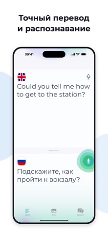
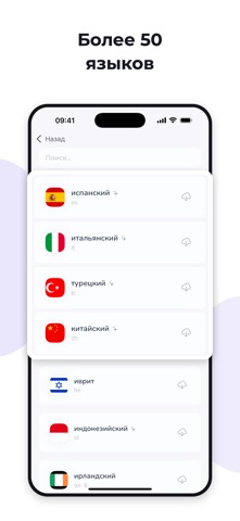
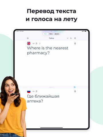
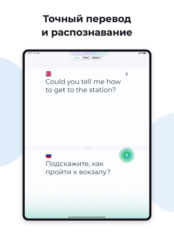
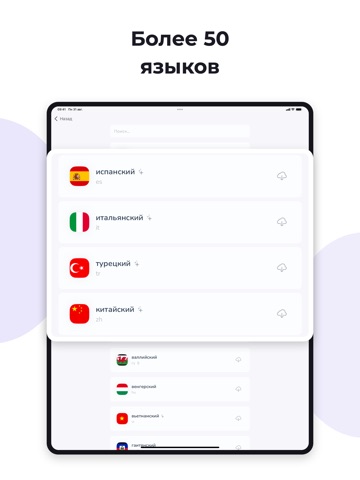
Мгновенно преодолей языковой барьер с Talkie – универсальным переводчиком голоса, текста и фото. Идеален для путешествий, изучения языков и повседневного общения без ограничений. Talkie – это больше, чем переводчик. Это умный помощник для общения в реальной жизни. Уникальные возможности: Перевод в реальном времени Переводи голос и текст мгновенно – говори или вводи, и получай результат без задержек. Оффлайн режим Работает даже без интернета – идеально в путешествиях или при отсутствии связи. История переводов Храни и пересматривай предыдущие переводы в любое время. Озвучка перевода Слушай результат перевода вслух с естественным произношением. Быстрое копирование и вставка Один тап – и текст вставлен или скопирован. Режим диалога Говори с другим человеком на разных языках – приложение распознаёт обе стороны и переводит автоматически. Светлая и тёмная тема Современный дизайн адаптир…
App details
What you can learn from Переводчик без интернета +
Every shipping app on the App Store has gone through the same decisions you're working through right now: which screenshot goes first, what caption sits over it, which device frame to show, what color the background should be. The 12 screenshots above are Переводчик без интернета +'s answers to those questions — they're public, they're real, and they made it through Apple's review.
What the numbers say: Переводчик без интернета + runs a light set with one background colour (#FCFCFC) carried across every screenshot — the listing reads as a single poster when the shots sit side by side in search results. The accent colour we picked up, #FCAC34, is the one to reuse for badges, arrows and highlighted words if you borrow this look. Hit Use this style to open the editor with these exact colours and drop your own screenshot in.
Notice the first screenshot in particular. It's the one users see in search results and on the product page, and it's where most apps spend their best caption and tightest design. Look at the proportion of background to phone, where the text sits, what one thing the image is trying to communicate.
Want to see how other Education apps approach the same problem? Browse more Education apps in the showcase.
Take what works into your own screenshots
Open LaunchShots and design your App Store & Google Play screenshots — pick a device frame, drop captions, ship in minutes. Free, in your browser.
Open the screenshot editor →Apps with a similar look
Closest background + accent colours among the listings we've analysed — useful when you want to see the same palette handled by a different team.