Chart position — tracked daily by LaunchShots
Screenshot style breakdown
Sampled from 5 of ニッポン征服 - 面白い 選択ゲーム's App Store screenshots — background, accent and theme, measured by LaunchShots (not something Apple publishes).
#D4D4D4 bg
#BABABA
#04CCFC accent
#111111 text
Screenshots
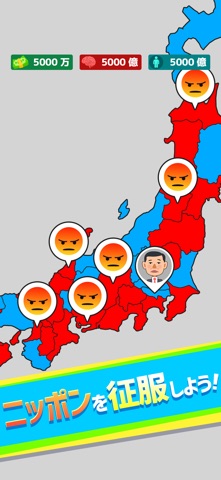


iPad screenshots


Icon palette
About this app
あなたの選択で国が変わる! あなたは日本の総理大臣として、さまざまな政策を選択し、理想の国づくりを目指します。 正しい選択をすれば、人口・お金・頭脳が増加し、国は繁栄します。 しかし、間違った選択をすると、これらの資源が減少し、国の存続が危ぶまれることも…。 人口を増やして敵と戦い、お金を増やして領地を広げ、頭脳を増やして軍事を強化しよう! 他国と友好を深めると平和条約を結んで仲間になることも…!? 平和か戦争か、あなたの戦術でより良い国を目指しましょう。 さあ、あなたの判断で理想の国を築き上げましょう! ※このゲームはフィクションです。 登場する人物・政党・政策・陰謀論などはすべて架空のものです。 実在の誰かに似ていたら、それはきっと気のせいです。 *このアプリの音声は音読さんを使用しています。 https://ondoku3.com/ja/
App details
What you can learn from ニッポン征服 - 面白い 選択ゲーム
Every shipping app on the App Store has gone through the same decisions you're working through right now: which screenshot goes first, what caption sits over it, which device frame to show, what color the background should be. The 10 screenshots above are ニッポン征服 - 面白い 選択ゲーム's answers to those questions — they're public, they're real, and they made it through Apple's review.
What the numbers say: ニッポン征服 - 面白い 選択ゲーム runs a mixed light-and-dark set where the background shifts from screenshot to screenshot (first shot #D4D4D4) — each image has to stand on its own, so the captions carry more of the story. The accent colour we picked up, #04CCFC, is the one to reuse for badges, arrows and highlighted words if you borrow this look. Hit Use this style to open the editor with these exact colours and drop your own screenshot in.
Notice the first screenshot in particular. It's the one users see in search results and on the product page, and it's where most apps spend their best caption and tightest design. Look at the proportion of background to phone, where the text sits, what one thing the image is trying to communicate.
Want to see how other Games apps approach the same problem? Browse more Games apps in the showcase.
Take what works into your own screenshots
Open LaunchShots and design your App Store & Google Play screenshots — pick a device frame, drop captions, ship in minutes. Free, in your browser.
Open the screenshot editor →Apps with a similar look
Closest background + accent colours among the listings we've analysed — useful when you want to see the same palette handled by a different team.