Screenshot changes — detected by LaunchShots
Screenshot style breakdown
Sampled from 6 of Femmefysio's App Store screenshots — background, accent and theme, measured by LaunchShots (not something Apple publishes).
#2C1C34 bg
#493B50
#745444 accent
#FFFFFF text
Screenshots


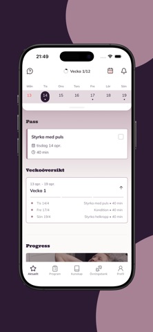


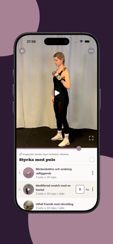
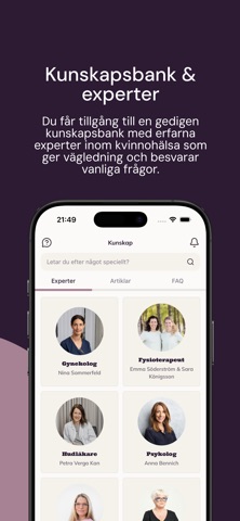


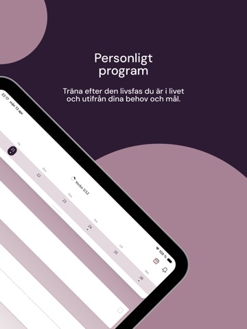
iPad screenshots



Icon palette
About this app
Oavsett om du är gravid, nybliven mamma, tränar genom vuxenlivet eller befinner dig i klimakteriet finns vi på Femmefysio här för att guida dig. Vår vision är att skapa ökad kunskap om kvinnokroppen genom hela livet och att ge dig verktyg för att känna dig stark, trygg och peppad i din träning. Genom korta föreläsningar och artiklar får du viktig kunskap som hjälper dig att förstå kroppen bättre. Våra träningsprogram startar från grunden och stegras stegvis – oavsett om du är i återhämtning efter graviditet och förlossning, tränar långsiktigt genom vuxenlivet eller vill anpassa träningen till de förändringar som kan uppstå i klimakteriet. Programmen är flexibla och fungerar även när livspusslet gör tidenknapp. Du får tillgång till effektiva hemövningar som utmanar, men också våra bästa gymövningar för styrka och uthållighet. För dig som vill komma igång med löpträning visar vi vägen,…
App details
What you can learn from Femmefysio
Every shipping app on the App Store has gone through the same decisions you're working through right now: which screenshot goes first, what caption sits over it, which device frame to show, what color the background should be. The 14 screenshots above are Femmefysio's answers to those questions — they're public, they're real, and they made it through Apple's review.
What the numbers say: Femmefysio runs a dark set where the background shifts from screenshot to screenshot (first shot #2C1C34) — each image has to stand on its own, so the captions carry more of the story. The accent colour we picked up, #745444, is the one to reuse for badges, arrows and highlighted words if you borrow this look. Hit Use this style to open the editor with these exact colours and drop your own screenshot in.
Notice the first screenshot in particular. It's the one users see in search results and on the product page, and it's where most apps spend their best caption and tightest design. Look at the proportion of background to phone, where the text sits, what one thing the image is trying to communicate.
Want to see how other Health & Fitness apps approach the same problem? Browse more Health & Fitness apps in the showcase.
Take what works into your own screenshots
Open LaunchShots and design your App Store & Google Play screenshots — pick a device frame, drop captions, ship in minutes. Free, in your browser.
Open the screenshot editor →Apps with a similar look
Closest background + accent colours among the listings we've analysed — useful when you want to see the same palette handled by a different team.