Chart position — tracked daily by LaunchShots
Screenshot changes — detected by LaunchShots
Screenshot style breakdown
Sampled from 5 of Tazeco's App Store screenshots — background, accent and theme, measured by LaunchShots (not something Apple publishes).
#040404 bg
#272727
#AC7454 accent
#FFFFFF text
Reading the caption text from the screenshots in your browser…
Screenshots

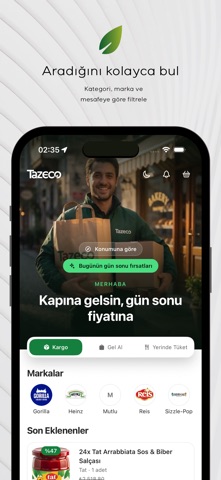
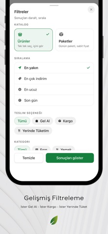

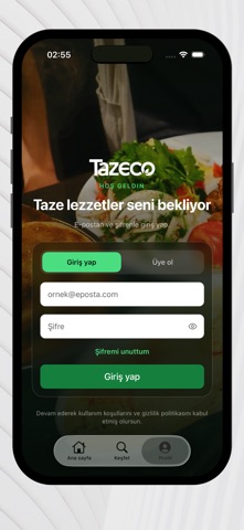
Icon palette
About this app
Tazeco, restoran, kafe, fırın ve marketlerde fazla üretilen ancak hâlâ taze ve tüketilebilir durumdaki yiyecekleri indirimli olarak alabileceğin sürdürülebilir bir alışveriş platformudur. Gıda israfını azaltırken hem bütçeni hem de doğayı korumana yardımcı olur. Uygulama Özellikleri: - Keşfet: Harita veya liste üzerinden yakınındaki mağazaları keşfet. - Teslim Saatini Seç: Paketini sana uygun zaman aralığında ayırt ve mağazadan teslim al. - Güvenli Ödeme: Ödemelerini Paratika altyapısıyla güvenli şekilde yap. Kart bilgilerin saklanmaz. - Gerçek Zamanlı Bildirimler: Yeni paketler eklendiğinde anında haberdar ol. - Deneyimini Puanla: Sipariş sonrası mağazaları puanla ve yorum yap. Tazeco’nun Avantajları - Uygun fiyatlı yiyecekleri keşfetme - Fazla ürünleri değerlendirerek tasarruf sağlama - Gıda kaybını azaltarak çevreye katkı - Yeni lezzetler ve yeni işletmeler tanıma - Daha sürdürüle…
App details
What you can learn from Tazeco
Every shipping app on the App Store has gone through the same decisions you're working through right now: which screenshot goes first, what caption sits over it, which device frame to show, what color the background should be. The 5 screenshots above are Tazeco's answers to those questions — they're public, they're real, and they made it through Apple's review.
What the numbers say: Tazeco runs a mixed light-and-dark set where the background shifts from screenshot to screenshot (first shot #040404) — each image has to stand on its own, so the captions carry more of the story. The accent colour we picked up, #AC7454, is the one to reuse for badges, arrows and highlighted words if you borrow this look. Hit Use this style to open the editor with these exact colours and drop your own screenshot in.
Notice the first screenshot in particular. It's the one users see in search results and on the product page, and it's where most apps spend their best caption and tightest design. Look at the proportion of background to phone, where the text sits, what one thing the image is trying to communicate.
Want to see how other Food & Drink apps approach the same problem? Browse more Food & Drink apps in the showcase.
Take what works into your own screenshots
Open LaunchShots and design your App Store & Google Play screenshots — pick a device frame, drop captions, ship in minutes. Free, in your browser.
Open the screenshot editor →Apps with a similar look
Closest background + accent colours among the listings we've analysed — useful when you want to see the same palette handled by a different team.