Chart position — tracked daily by LaunchShots
Screenshot changes — detected by LaunchShots
Screenshot style breakdown
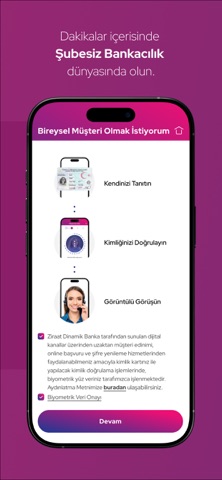
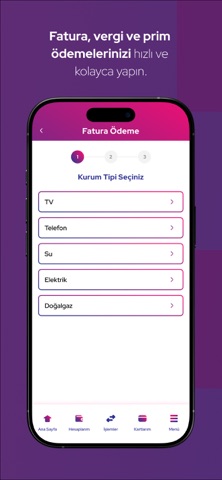
Sampled from 6 of Ziraat Dinamik Mobil's App Store screenshots — background, accent and theme, measured by LaunchShots (not something Apple publishes).
#BC246C bg
#C54280
#64143C accent
#FFFFFF text
- #2EFT, FAST ve HAVALE
- #3Bankkart ayricaliklarindan kart aidatı ödemeden yararlanın.
- #4Avantajlı faiz oranları ile Dijital Kredi kullanın.
- #5Birikimlerinizi Ziraat Dinamik ile değerlendirin.
Captions read from the screenshots (OCR, may contain small errors): 4 headlines, 5.5 words on average (longest 7).
Screenshots



Icon palette
About this app
Yeni Nesil Bankacılık hizmetlerinden yararlanabilmeniz için Ziraat Dinamik Yanınızda! Finansal ihtiyaçlarınızı hızlı, güvenli ve kolay bir şekilde karşılayabilmek için Ziraat Dinamik Mobil sizlerle. Geleneksel bankacılığın sınırlarını aşan, tamamen dijital ve kullanıcı dostu bir deneyim sunan Bankamıza dakikalar içinde müşteri olabilirsiniz. Ziraat Dinamik Mobil ile; • Ziraat Dinamik Mobil’de kullanabileceğiniz Dijital Onay sayesinde işlemlerinizi güvenli bir şekilde gerçekleştirebilirsiniz. • Kısayollarım ile en sık kullandığınız bankacılık işlemlerini tek dokunuşla erişebileceğiniz şekilde kişiselleştirebilirsiniz. • Sizin için seçtiğimiz tema ve arka plan görselleri ile uygulamanızı kişiselleştirebilirsiniz. • Kredi, kredili mevduat hesabı ve kart başvurularınızı hızlı ve kolayca yapabilirsiniz. • Banka ve kredi kartı özelliklerini tek bir kartta b…
App details
What you can learn from Ziraat Dinamik Mobil
Every shipping app on the App Store has gone through the same decisions you're working through right now: which screenshot goes first, what caption sits over it, which device frame to show, what color the background should be. The 10 screenshots above are Ziraat Dinamik Mobil's answers to those questions — they're public, they're real, and they made it through Apple's review.
What the numbers say: Ziraat Dinamik Mobil runs a dark set where the background shifts from screenshot to screenshot (first shot #BC246C) — each image has to stand on its own, so the captions carry more of the story. The accent colour we picked up, #64143C, is the one to reuse for badges, arrows and highlighted words if you borrow this look. Hit Use this style to open the editor with these exact colours and drop your own screenshot in.
Notice the first screenshot in particular. It's the one users see in search results and on the product page, and it's where most apps spend their best caption and tightest design. Look at the proportion of background to phone, where the text sits, what one thing the image is trying to communicate.
Want to see how other Finance apps approach the same problem? Browse more Finance apps in the showcase.
Take what works into your own screenshots
Open LaunchShots and design your App Store & Google Play screenshots — pick a device frame, drop captions, ship in minutes. Free, in your browser.
Open the screenshot editor →Apps with a similar look
Closest background + accent colours among the listings we've analysed — useful when you want to see the same palette handled by a different team.