Screenshot style breakdown
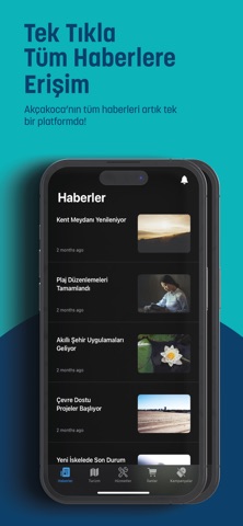
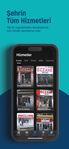
Sampled from 4 of Akçakoca Burada's App Store screenshots — background, accent and theme, measured by LaunchShots (not something Apple publishes).
#0CB4BC bg
#0A9EA5
#0C3C6C accent
#111111 text
Screenshots


Icon palette
About this app
Akçakoca'nın nabzı artık avucunuzda atıyor! "Akçakoca Burada" mobil uygulaması ile Düzce'nin incisi Akçakoca'ya dair aradığınız her bilgiye kolayca ulaşın. İlçede yaşanan en güncel haberlerden, son dakika gelişmelerine, cenaze duyurularından nöbetçi eczane ve taksi bilgilerine kadar her şey tek bir platformda birleşti. Akçakoca'da olup bitenleri anında takip edin, hiçbir önemli gelişmeyi kaçırmayın! Akçakoca'yı Keşfedin! Yerel İşletmeler, Turistik Rehber ve Daha Fazlası... "Akçakoca Burada" sadece güncel bilgiler sunmakla kalmıyor, aynı zamanda ilçemizi ziyaret eden veya etmeyi planlayan misafirlerimiz için kapsamlı bir Akçakoca rehberi sunuyor. "Akçakoca'da nereye gidilir?" sorusunun cevabı artık çok kolay! Uygulamamız sayesinde tarihi ve kültürel alanlara, plajlara, piknik ve mesire alanlarına ait tüm bilgilere, fotoğraflara ve tek tuşla ulaşım rotalarına erişebilirsiniz. Ayrıca, Akç…
App details
What you can learn from Akçakoca Burada
Every shipping app on the App Store has gone through the same decisions you're working through right now: which screenshot goes first, what caption sits over it, which device frame to show, what color the background should be. The 4 screenshots above are Akçakoca Burada's answers to those questions — they're public, they're real, and they made it through Apple's review.
What the numbers say: Akçakoca Burada runs a light set with one background colour (#0CB4BC) carried across every screenshot — the listing reads as a single poster when the shots sit side by side in search results. The accent colour we picked up, #0C3C6C, is the one to reuse for badges, arrows and highlighted words if you borrow this look. Hit Use this style to open the editor with these exact colours and drop your own screenshot in.
Notice the first screenshot in particular. It's the one users see in search results and on the product page, and it's where most apps spend their best caption and tightest design. Look at the proportion of background to phone, where the text sits, what one thing the image is trying to communicate.
Want to see how other News apps approach the same problem? Browse more News apps in the showcase.
Take what works into your own screenshots
Open LaunchShots and design your App Store & Google Play screenshots — pick a device frame, drop captions, ship in minutes. Free, in your browser.
Open the screenshot editor →Apps with a similar look
Closest background + accent colours among the listings we've analysed — useful when you want to see the same palette handled by a different team.