Screenshot style breakdown
Sampled from 6 of Chiến Tuyến Hướng Dương's App Store screenshots — background, accent and theme, measured by LaunchShots (not something Apple publishes).
#B4341C bg
#BE503B
#E4BC84 accent
#FFFFFF text
Screenshots
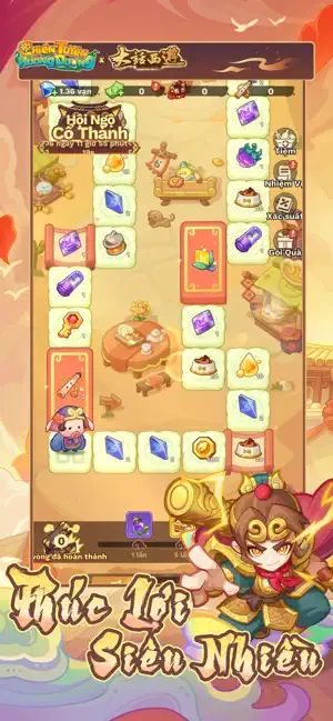
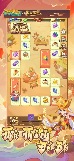
Icon palette
About this app
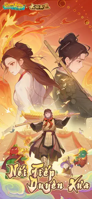
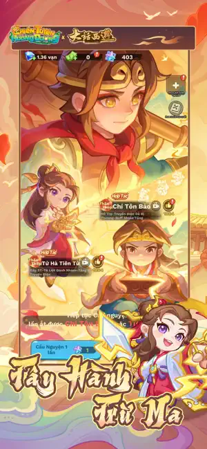
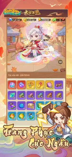
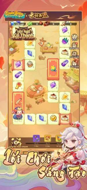
"Gần trăm loại Thực Vật lai tạo mới – Chiến lực bùng nổ, bảo vệ Gia Viên Thực Vật! Hợp tác mới: Tử Hà Tiên Tử X Chí Tôn Bảo [Đồng Hành Tây Du] chính thức ra mắt! Mau đến tham gia ngay! Đăng nhập lần đầu là tặng ngay Thực Vật Truyền Thuyết Vàng - Ngộ Không Đào, Sen Quan Âm, Thực Vật Sử thi Tím - Vải Dứa và Vua Hoa, cùng nhiều nguyên liệu nâng cấp cao cấp và rất nhiều vàng đang chờ bạn đến nhận! Còn có trang phục đặc sắc – Siêu Nhân Nón Lá và vũ khí đặc biệt – Ống Tre Tia Lửa tặng miễn phí! Trong một nông trường đang bị khủng hoảng bao vây, bạn sẽ vào vai người chủ nông trường, dẫn dắt các chiến binh thực vật với tính cách độc đáo, chiến đấu để bảo vệ Nữ hoàng Hướng Dương, biểu tượng của hy vọng, chống lại làn sóng xâm lược của các sinh vật biến dị! Hãy bố trí chiến lược phòng thủ bằng thực vật và giữ vững sự sống cho nông trường! ""Ngoài lối chơi chính đầy kịch tính và hồi hộp, Chiến T…
App details
What you can learn from Chiến Tuyến Hướng Dương
Every shipping app on the App Store has gone through the same decisions you're working through right now: which screenshot goes first, what caption sits over it, which device frame to show, what color the background should be. The 6 screenshots above are Chiến Tuyến Hướng Dương's answers to those questions — they're public, they're real, and they made it through Apple's review.
What the numbers say: Chiến Tuyến Hướng Dương runs a mixed light-and-dark set where the background shifts from screenshot to screenshot (first shot #B4341C) — each image has to stand on its own, so the captions carry more of the story. The accent colour we picked up, #E4BC84, is the one to reuse for badges, arrows and highlighted words if you borrow this look. Hit Use this style to open the editor with these exact colours and drop your own screenshot in.
Notice the first screenshot in particular. It's the one users see in search results and on the product page, and it's where most apps spend their best caption and tightest design. Look at the proportion of background to phone, where the text sits, what one thing the image is trying to communicate.
Want to see how other Games apps approach the same problem? Browse more Games apps in the showcase.
Take what works into your own screenshots
Open LaunchShots and design your App Store & Google Play screenshots — pick a device frame, drop captions, ship in minutes. Free, in your browser.
Open the screenshot editor →Apps with a similar look
Closest background + accent colours among the listings we've analysed — useful when you want to see the same palette handled by a different team.