Screenshot changes — detected by LaunchShots
Screenshot style breakdown
Sampled from 6 of Kojo: Régime & Suivi Calorique's App Store screenshots — background, accent and theme, measured by LaunchShots (not something Apple publishes).
#249CE4 bg
#42A9E7
#94CCF4 accent
#FFFFFF text
Reading the caption text from the screenshots in your browser…
Screenshots

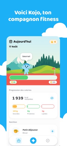
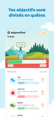
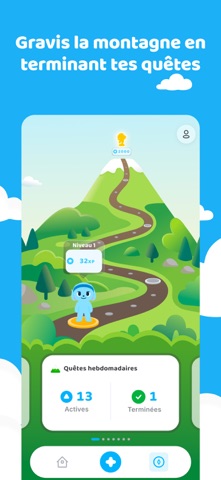

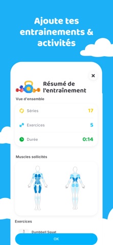


Icon palette
About this app
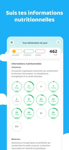
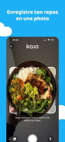
Kojo transforme les habitudes saines en un jeu auquel tu auras vraiment envie de jouer. Enregistre tes repas, termine tes entraînements, atteins tes objectifs hebdomadaires et gagne de l’XP au fil de tes progrès. Monte de niveau, débloque de nouveaux mondes et reste motivé avec Kojo, ta mascotte et ton compagnon personnel. Que ton objectif soit de perdre du poids, de prendre du muscle ou simplement de rester régulier, Kojo divise ton parcours en petites étapes atteignables pour que tu saches toujours quoi faire ensuite. Suis ton alimentation en quelques secondes. Parle, écris, scanne un code-barres ou prends une photo d’une liste d’ingrédients, et Kojo t’aide à compléter les détails. Tes calories et macros s’adaptent à ton objectif et à ton rythme, pour garder des cibles réalistes et faciles à suivre. Suis un programme d’entraînement conçu autour de ton objectif, ou enregistre tes p…
App details
What you can learn from Kojo: Régime & Suivi Calorique
Every shipping app on the App Store has gone through the same decisions you're working through right now: which screenshot goes first, what caption sits over it, which device frame to show, what color the background should be. The 10 screenshots above are Kojo: Régime & Suivi Calorique's answers to those questions — they're public, they're real, and they made it through Apple's review.
What the numbers say: Kojo: Régime & Suivi Calorique runs a mixed light-and-dark set where the background shifts from screenshot to screenshot (first shot #249CE4) — each image has to stand on its own, so the captions carry more of the story. The accent colour we picked up, #94CCF4, is the one to reuse for badges, arrows and highlighted words if you borrow this look. Hit Use this style to open the editor with these exact colours and drop your own screenshot in.
Notice the first screenshot in particular. It's the one users see in search results and on the product page, and it's where most apps spend their best caption and tightest design. Look at the proportion of background to phone, where the text sits, what one thing the image is trying to communicate.
Want to see how other Health & Fitness apps approach the same problem? Browse more Health & Fitness apps in the showcase.
Take what works into your own screenshots
Open LaunchShots and design your App Store & Google Play screenshots — pick a device frame, drop captions, ship in minutes. Free, in your browser.
Open the screenshot editor →Apps with a similar look
Closest background + accent colours among the listings we've analysed — useful when you want to see the same palette handled by a different team.