Chart position — tracked daily by LaunchShots
Screenshot style breakdown
Sampled from 3 of Anitabi's App Store screenshots — background, accent and theme, measured by LaunchShots (not something Apple publishes).
#DCF4E4 bg
#C1D6C8
#F4CC5C accent
#111111 text
Screenshots

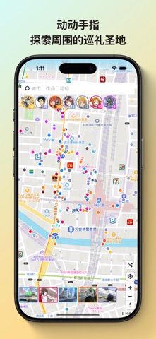
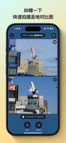
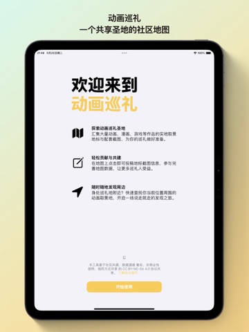
iPad screenshots


Icon palette
About this app
Anitabi Map - 动画巡礼地图 告别繁琐的行前准备,轻松开启你的动画圣地巡礼之旅! Anitabi Map 动画巡礼地图 是一款专为喜爱动画、漫画、游戏、小说等作品的你打造的圣地巡礼辅助工具。我们致力于汇集全球巡礼爱好者的力量,共享作品的取景地标与对应截图,让寻找“次元之壁”在现实世界中的交汇点变得前所未有的简单。 核心亮点: 降低巡礼门槛: 我们整合了大量由巡礼人整理和贡献的作品地标与截图信息,省去你独自查找、比对的耗时工作,让你说走就走! 随时随地探索: 基于地图功能,你可以直观地发现身边的动画圣地,无论是计划行程还是临时起意,都能轻松找到目的地。 主要功能: 地图浏览与查找: 在地图上查看各类作品的取景地标,支持根据作品名称或地点进行搜索。 地标详情展示: 点击地标,查看详细信息、用户贡献的对比截图,重温作品中的经典场景。 便捷投稿贡献: 发现新的圣地或想补充已有信息?在地图上对应坐标点击,即可轻松提交地标位置和截图信息,与全球巡礼人共享你的发现(投稿内容需审核后显示)。 海量作品信息: 数据库持续建设中,涵盖丰富的…
App details
What you can learn from Anitabi
Every shipping app on the App Store has gone through the same decisions you're working through right now: which screenshot goes first, what caption sits over it, which device frame to show, what color the background should be. The 6 screenshots above are Anitabi's answers to those questions — they're public, they're real, and they made it through Apple's review.
What the numbers say: Anitabi runs a light set with one background colour (#DCF4E4) carried across every screenshot — the listing reads as a single poster when the shots sit side by side in search results. The accent colour we picked up, #F4CC5C, is the one to reuse for badges, arrows and highlighted words if you borrow this look. Hit Use this style to open the editor with these exact colours and drop your own screenshot in.
Notice the first screenshot in particular. It's the one users see in search results and on the product page, and it's where most apps spend their best caption and tightest design. Look at the proportion of background to phone, where the text sits, what one thing the image is trying to communicate.
Want to see how other Travel apps approach the same problem? Browse more Travel apps in the showcase.
Take what works into your own screenshots
Open LaunchShots and design your App Store & Google Play screenshots — pick a device frame, drop captions, ship in minutes. Free, in your browser.
Open the screenshot editor →Apps with a similar look
Closest background + accent colours among the listings we've analysed — useful when you want to see the same palette handled by a different team.