Chart position — tracked daily by LaunchShots
Screenshot changes — detected by LaunchShots
Screenshot style breakdown
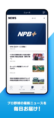
Sampled from 6 of NPB+ -プロ野球速報アプリ-'s App Store screenshots — background, accent and theme, measured by LaunchShots (not something Apple publishes).
#FCFCFC bg
#DDDDDD
#0C9CE4 accent
#111111 text
Reading the caption text from the screenshots in your browser…
Screenshots
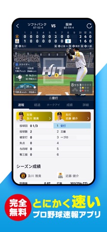
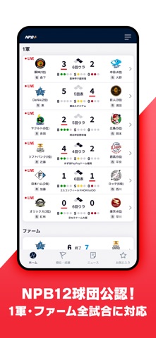
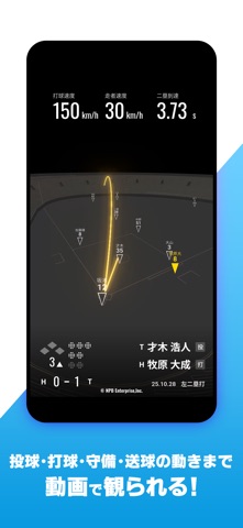
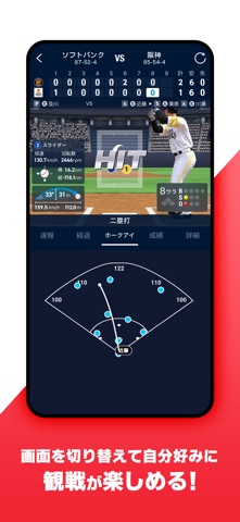



Icon palette
About this app
すべてのプロ野球ファン必携、今までの一球速報を超えた、【NPB公認】プロ野球速報アプリ! 野球ファンのための決定版プロ野球速報アプリです。 ◆「NPB公認」のプロ野球速報アプリ◆ NPBエンタープライズが手がける、NPB12球団公認のプロ野球速報データが見られるプロ野球速報アプリ。 野球、プロ野球をもっと楽しみたい方におすすめです。 ・野球観戦が好きな方、プロ野球ファン ・応援している球団の試合や選手情報を毎日チェックしている ・球場観戦できなくても、1球1球のワクワクドキドキを味わいたい ・野球のいろんなデータをみて分析や予想するのが好き ・野球ゲームのような視点や臨場感でプロ野球をもっと楽しみたい ◆選手の投球・打撃・走塁・守備を可視化!リアルすぎるプロ野球速報◆ 打球の軌道、守備の動き、投球の回転数まで、従来の速報では得られなかった詳細データをリアルタイムで表示。 一球一球がリアルなデータで見られ、野球観戦がもっと深く、もっと面白くなる!プロ野球の試合をより深く理解できるプロ野球速報アプリです。 ◆見やすくなっ…
App details
What you can learn from NPB+ -プロ野球速報アプリ-
Every shipping app on the App Store has gone through the same decisions you're working through right now: which screenshot goes first, what caption sits over it, which device frame to show, what color the background should be. The 8 screenshots above are NPB+ -プロ野球速報アプリ-'s answers to those questions — they're public, they're real, and they made it through Apple's review.
What the numbers say: NPB+ -プロ野球速報アプリ- runs a light set with one background colour (#FCFCFC) carried across every screenshot — the listing reads as a single poster when the shots sit side by side in search results. The accent colour we picked up, #0C9CE4, is the one to reuse for badges, arrows and highlighted words if you borrow this look. Hit Use this style to open the editor with these exact colours and drop your own screenshot in.
Notice the first screenshot in particular. It's the one users see in search results and on the product page, and it's where most apps spend their best caption and tightest design. Look at the proportion of background to phone, where the text sits, what one thing the image is trying to communicate.
Want to see how other Sports apps approach the same problem? Browse more Sports apps in the showcase.
Take what works into your own screenshots
Open LaunchShots and design your App Store & Google Play screenshots — pick a device frame, drop captions, ship in minutes. Free, in your browser.
Open the screenshot editor →Apps with a similar look
Closest background + accent colours among the listings we've analysed — useful when you want to see the same palette handled by a different team.