Screenshot style breakdown
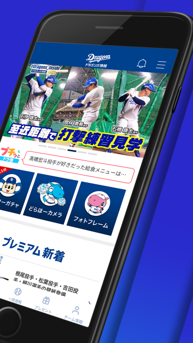
Sampled from 6 of ドラゴンズ情報公式アプリ's App Store screenshots — background, accent and theme, measured by LaunchShots (not something Apple publishes).
#2C2CCC bg
#4949D3
#FCFC0C accent
#FFFFFF text
Screenshots



Icon palette
About this app
「ドラゴンズ情報公式アプリ」が登場! 選手の素顔が見られる動画や監督コラムなど、ここでしか見られないコンテンツが盛り沢山。ガチャやクーポンなどアプリ限定機能も! ■ここでしか見られないプレミアムコンテンツ 注目選手を深掘りする動画インタビューや特別対談企画など、選手の素顔に迫るコンテンツが盛り沢山!監督の独自コラムも配信中! ■アプリ限定のお楽しみコンテンツ満載 デイリーガチャでアプリ限定の選手画像をプレゼント。 どらほーカメラやオリジナルフォトフレームで勝どきをあげよう! ■試合情報をリアルタイムにチェック 選手コメントやコース別の対戦データを見ながらリアルタイムに試合情報をチェックできます。 ■アプリからお知らせが届く 試合速報や最新コンテンツの更新をプッシュ通知でいち早くお知らせします。 ■お得なクーポン ダウンロード特典やお誕生日クーポンなどをお届けします。 ※ ネットワーク環境が良好でない状況でご利用されるとコンテンツが表示されない等、正常に動作しないことがあります。 【プッシュ通知につい…
App details
What you can learn from ドラゴンズ情報公式アプリ
Every shipping app on the App Store has gone through the same decisions you're working through right now: which screenshot goes first, what caption sits over it, which device frame to show, what color the background should be. The 7 screenshots above are ドラゴンズ情報公式アプリ's answers to those questions — they're public, they're real, and they made it through Apple's review.
What the numbers say: ドラゴンズ情報公式アプリ runs a mixed light-and-dark set where the background shifts from screenshot to screenshot (first shot #2C2CCC) — each image has to stand on its own, so the captions carry more of the story. The accent colour we picked up, #FCFC0C, is the one to reuse for badges, arrows and highlighted words if you borrow this look. Hit Use this style to open the editor with these exact colours and drop your own screenshot in.
Notice the first screenshot in particular. It's the one users see in search results and on the product page, and it's where most apps spend their best caption and tightest design. Look at the proportion of background to phone, where the text sits, what one thing the image is trying to communicate.
Want to see how other Sports apps approach the same problem? Browse more Sports apps in the showcase.
Take what works into your own screenshots
Open LaunchShots and design your App Store & Google Play screenshots — pick a device frame, drop captions, ship in minutes. Free, in your browser.
Open the screenshot editor →Apps with a similar look
Closest background + accent colours among the listings we've analysed — useful when you want to see the same palette handled by a different team.