Chart position — tracked daily by LaunchShots
Screenshot changes — detected by LaunchShots
Screenshot style breakdown
Sampled from 6 of RoboNeo's App Store screenshots — background, accent and theme, measured by LaunchShots (not something Apple publishes).
#040404 bg
#272727
#3CC4E4 accent
#FFFFFF text
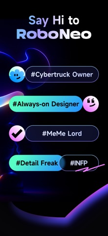
- #1Say Hi to RoboNeo
- #2Viral Short Films| Social Campaigns | Full Brand Rollouts « =
- #3Personal Photo Editor Outfit planner | Pose retake | Hairstyle retake
- #4Pro-level graphic designer Logo maker | Graphic design | Poster maker
- #5Viral motion control Character match | Action transfer | Expression mimic
- #6Trendy video editor Product listing videos | Visual hooks | Video Enhancement
Captions read from the screenshots (OCR, may contain small errors): 6 headlines, 10 words on average (longest 12).
Screenshots


Icon palette
About this app
● O RoboNeo é um agente criativo de IA que oferece interação em linguagem natural para edição e geração de imagens, produção e criação de vídeos, além de outras necessidades de design. ● Mais especificamente: o RoboNeo permite que você organize instantaneamente suas próprias equipes de agentes, com roteiristas, designers, diretores, operadores e muito mais, combinados de forma flexível para impulsionar todo o seu fluxo de criação de conteúdo, desde curtas-metragens até campanhas de branding. ● Pode funcionar como um editor de fotos, permitindo mudanças de roupa, penteado e pose, remoção de marcas d’água, troca de fundo, retoques diários e filtros de IA virais. ● Também pode atuar como um designer gráfico profissional para tarefas gerais de design, como geração de pôsteres, imagens para catálogos de produtos, criação de memes, design de logotipos e identidade visual. ● É igualmen…
App details
What you can learn from RoboNeo
Every shipping app on the App Store has gone through the same decisions you're working through right now: which screenshot goes first, what caption sits over it, which device frame to show, what color the background should be. The 6 screenshots above are RoboNeo's answers to those questions — they're public, they're real, and they made it through Apple's review.
What the numbers say: RoboNeo runs a dark set with one background colour (#040404) carried across every screenshot — the listing reads as a single poster when the shots sit side by side in search results. The accent colour we picked up, #3CC4E4, is the one to reuse for badges, arrows and highlighted words if you borrow this look. Hit Use this style to open the editor with these exact colours and drop your own screenshot in.
Notice the first screenshot in particular. It's the one users see in search results and on the product page, and it's where most apps spend their best caption and tightest design. Look at the proportion of background to phone, where the text sits, what one thing the image is trying to communicate.
Want to see how other Graphics & Design apps approach the same problem? Browse more Graphics & Design apps in the showcase.
Take what works into your own screenshots
Open LaunchShots and design your App Store & Google Play screenshots — pick a device frame, drop captions, ship in minutes. Free, in your browser.
Open the screenshot editor →Apps with a similar look
Closest background + accent colours among the listings we've analysed — useful when you want to see the same palette handled by a different team.