Chart position — tracked daily by LaunchShots
Screenshot changes — detected by LaunchShots
Screenshot style breakdown
Sampled from 6 of Artie: Aprende piano con IA's App Store screenshots — background, accent and theme, measured by LaunchShots (not something Apple publishes).
#04040C bg
#27272E
#7CF4D4 accent
#FFFFFF text
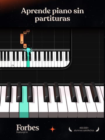
- #1Aprende piano sin partituras
- #2Aprende las canciones que te gustan
- #3Comentarios en tiempo real
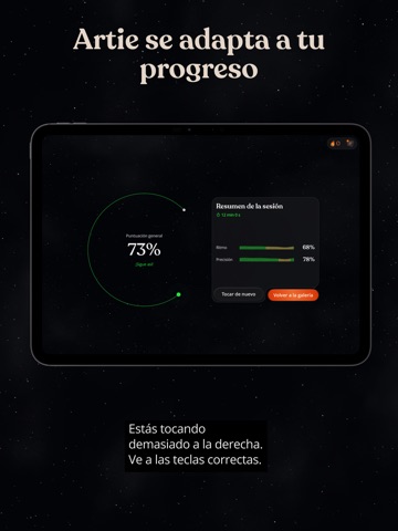
- #4Artie se adapta a tu progreso
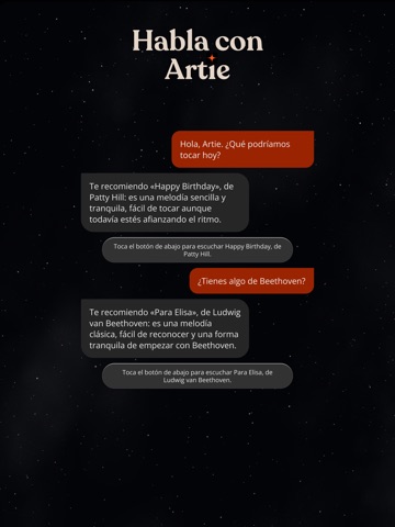
- #5Habla con Artie
- #6Toca tu primera cancion hoy
Captions read from the screenshots (OCR, may contain small errors): 6 headlines, 4.7 words on average (longest 6).
Screenshots


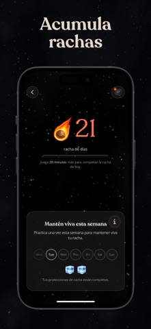

iPad screenshots





Icon palette
About this app
Incluso si nunca has tocado un piano, puedes empezar a tocar las canciones que te gustan. Explora una biblioteca con más de cien canciones seleccionadas cuidadosamente: desde éxitos actuales y bandas sonoras hasta clásicos atemporales y canciones favoritas para niños. TOCA · APRENDE · MEJORA - Comentarios y consejos en tiempo real. Artie escucha mientras tocas y te ofrece sugerencias prácticas al instante para mejorar tu ritmo y precisión. - Niveles pensados para principiantes. Fácil, Intermedio y Difícil, diseñados por músicos ganadores de premios Grammy. - Herramientas de práctica flexibles. Repite las partes más difíciles, reduce la velocidad y practica con una o ambas manos. - Compatible con cualquier piano. Funciona con cualquier teclado o piano, acústico o digital. - Sigue tu progreso. Sigue un plan personalizado, mantén una racha semanal de práctica (10 minutos, 3 veces por se…
App details
What you can learn from Artie: Aprende piano con IA
Every shipping app on the App Store has gone through the same decisions you're working through right now: which screenshot goes first, what caption sits over it, which device frame to show, what color the background should be. The 16 screenshots above are Artie: Aprende piano con IA's answers to those questions — they're public, they're real, and they made it through Apple's review.
What the numbers say: Artie: Aprende piano con IA runs a dark set with one background colour (#04040C) carried across every screenshot — the listing reads as a single poster when the shots sit side by side in search results. The accent colour we picked up, #7CF4D4, is the one to reuse for badges, arrows and highlighted words if you borrow this look. Hit Use this style to open the editor with these exact colours and drop your own screenshot in.
Notice the first screenshot in particular. It's the one users see in search results and on the product page, and it's where most apps spend their best caption and tightest design. Look at the proportion of background to phone, where the text sits, what one thing the image is trying to communicate.
Want to see how other Education apps approach the same problem? Browse more Education apps in the showcase.
Take what works into your own screenshots
Open LaunchShots and design your App Store & Google Play screenshots — pick a device frame, drop captions, ship in minutes. Free, in your browser.
Open the screenshot editor →Apps with a similar look
Closest background + accent colours among the listings we've analysed — useful when you want to see the same palette handled by a different team.