Screenshot style breakdown
Sampled from 6 of ロウロウの郷〜箱庭で楽しむ不思議な暮らし〜's App Store screenshots — background, accent and theme, measured by LaunchShots (not something Apple publishes).
#FCFCEC bg
#DDDDCF
#F4F48C accent
#111111 text
Screenshots
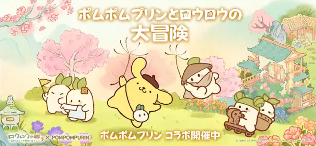


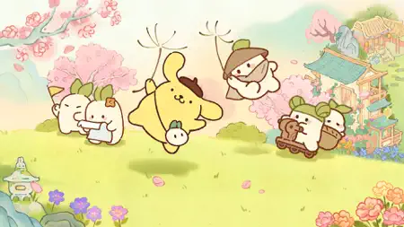
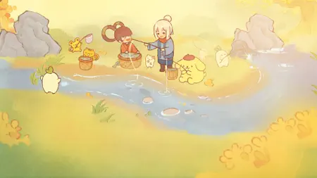
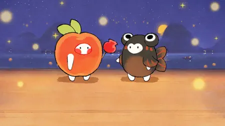
Icon palette
About this app
『ロウロウの郷〜箱庭で楽しむ不思議な暮らし〜』は、大根の妖精であるかわいいロウロウたちと一緒に、のんびりとした田園暮らしを楽しめる癒やしの箱庭生活ゲームです。 プレイヤーは、やわらかな風景に囲まれた郷で、自分のペースでゆっくりと過ごすことができます。 忙しい毎日の合間に、ほっとひと息つけるような、やさしくあたたかな時間が流れています。 畑を耕し、料理を作り、釣りを楽しみ、家具や装飾で家や庭を整えながら、少しずつ自分だけの暮らしを育てていきましょう。 ロウロウたちとの交流や着せ替え、物語の中で出会う小さな発見も、この郷で過ごす毎日をより特別なものにしてくれます。 『ロウロウの郷』で、あなただけのやさしい田園生活を始めてみませんか。 【ゲーム特徴】 ▷ロウロウたちと過ごす、ほっとする毎日◁ この郷では、かわいいロウロウたちがいつもそばに。 眺めているだけで心がゆるむような、やさしい時間を楽しめます。 ▷畑を耕し、季節の恵みを味わおう◁ 作物を育てて収穫し、料理を作り、釣りを楽しむ。 暮らしの中にある小…
App details
What you can learn from ロウロウの郷〜箱庭で楽しむ不思議な暮らし〜
Every shipping app on the App Store has gone through the same decisions you're working through right now: which screenshot goes first, what caption sits over it, which device frame to show, what color the background should be. The 7 screenshots above are ロウロウの郷〜箱庭で楽しむ不思議な暮らし〜's answers to those questions — they're public, they're real, and they made it through Apple's review.
What the numbers say: ロウロウの郷〜箱庭で楽しむ不思議な暮らし〜 runs a light set where the background shifts from screenshot to screenshot (first shot #FCFCEC) — each image has to stand on its own, so the captions carry more of the story. The accent colour we picked up, #F4F48C, is the one to reuse for badges, arrows and highlighted words if you borrow this look. Hit Use this style to open the editor with these exact colours and drop your own screenshot in.
Notice the first screenshot in particular. It's the one users see in search results and on the product page, and it's where most apps spend their best caption and tightest design. Look at the proportion of background to phone, where the text sits, what one thing the image is trying to communicate.
Want to see how other Games apps approach the same problem? Browse more Games apps in the showcase.
Take what works into your own screenshots
Open LaunchShots and design your App Store & Google Play screenshots — pick a device frame, drop captions, ship in minutes. Free, in your browser.
Open the screenshot editor →Apps with a similar look
Closest background + accent colours among the listings we've analysed — useful when you want to see the same palette handled by a different team.