Chart position — tracked daily by LaunchShots
Screenshot changes — detected by LaunchShots
Screenshot style breakdown
Sampled from 6 of KPSS Cep Kitabı's App Store screenshots — background, accent and theme, measured by LaunchShots (not something Apple publishes).
#FCFCF4 bg
#DDDDD6
#EC6434 accent
#111111 text
Screenshots



iPad screenshots




Icon palette
About this app
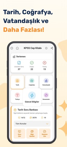
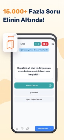
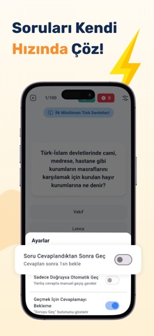
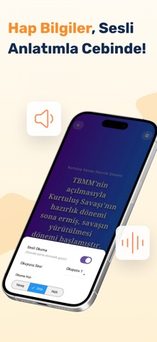
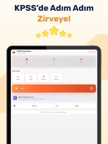
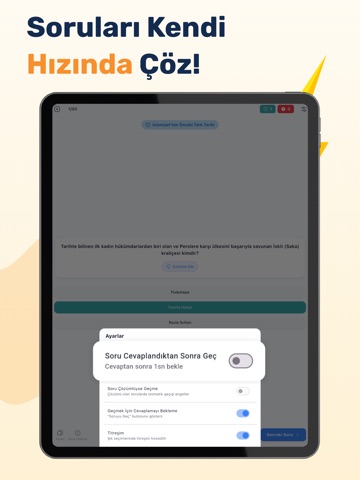
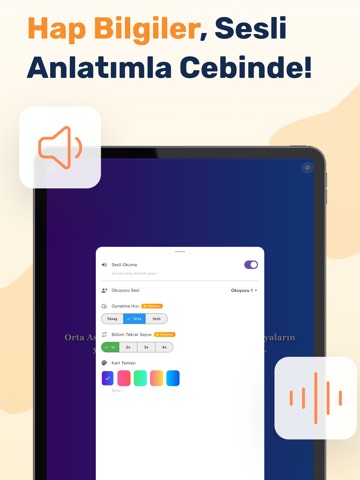
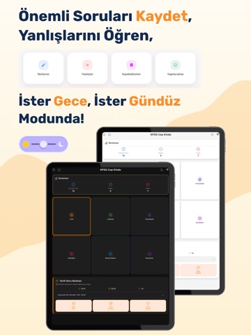
KPSS maratonunda en büyük destekçiniz, KPSS Cep Kitabı artık yanınızda! 15.000'den fazla güncel soru, binlerce bilgi kartı ve özel deneme sınavları ile sınav hazırlığınıza güç katın. Tamamen ücretsiz! Neden KPSS Cep Kitabı? DEV SORU ARŞİVİ: Tarih, Coğrafya, Vatandaşlık, Türkçe ve Güncel Bilgiler derslerinden özenle hazırlanmış 15.000'den fazla soruyla kendinizi test edin. BİLGİ KARTLARI (FLASHCARDS): En kritik bilgileri, akılda kalıcı bilgi kartları ile istediğiniz her an hızlıca tekrar edin. HEDEFE YÖNELİK ÇALIŞMA: Ünite ünite testlerle eksik olduğunuz konuları anında tespit edin ve üzerine gidin. SINAV PROVASI: Gerçek sınav deneyimini yaşamanız için özel olarak hazırlanan Ders Denemeleri ve Genel Deneme Sınavları ile zaman yönetiminizi geliştirin. PERFORMANS ANALİZİ: Hangi konuda eksiğiniz olduğunu görün, netlerinizi takip edin ve çalışma stratejinizi buna göre şekillendirin. T…
App details
What you can learn from KPSS Cep Kitabı
Every shipping app on the App Store has gone through the same decisions you're working through right now: which screenshot goes first, what caption sits over it, which device frame to show, what color the background should be. The 15 screenshots above are KPSS Cep Kitabı's answers to those questions — they're public, they're real, and they made it through Apple's review.
What the numbers say: KPSS Cep Kitabı runs a light set with one background colour (#FCFCF4) carried across every screenshot — the listing reads as a single poster when the shots sit side by side in search results. The accent colour we picked up, #EC6434, is the one to reuse for badges, arrows and highlighted words if you borrow this look. Hit Use this style to open the editor with these exact colours and drop your own screenshot in.
Notice the first screenshot in particular. It's the one users see in search results and on the product page, and it's where most apps spend their best caption and tightest design. Look at the proportion of background to phone, where the text sits, what one thing the image is trying to communicate.
Want to see how other Education apps approach the same problem? Browse more Education apps in the showcase.
Take what works into your own screenshots
Open LaunchShots and design your App Store & Google Play screenshots — pick a device frame, drop captions, ship in minutes. Free, in your browser.
Open the screenshot editor →Apps with a similar look
Closest background + accent colours among the listings we've analysed — useful when you want to see the same palette handled by a different team.