Chart position — tracked daily by LaunchShots
Screenshot style breakdown
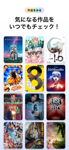
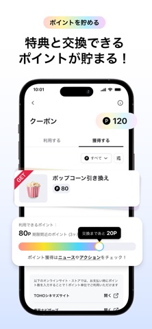
Sampled from 6 of TOHO-ONE 公式アプリ's App Store screenshots — background, accent and theme, measured by LaunchShots (not something Apple publishes).
#FCFCFC bg
#DDDDDD
#043CA4 accent
#111111 text
Screenshots




Icon palette
About this app
TOHO-ONEであなたの“好き”がもっと広がる! 「TOHO-ONE」は、映画を観る・演劇を観る・イベントに参加する・お買い物を楽しむ、多彩な東宝グループのエンタメをまるごと楽しめる会員サービスです。 ご利用金額に応じてポイントが貯まり、1ポイント=1円としてお支払い時に使えるだけでなく、映画のポイント鑑賞や劇場での飲食、グッズなどポイントを使ってお得に商品と交換したり、スタジオツアーや試写会など特別な体験への応募もできます。 さらに公式アプリでは、そのポイントの管理・交換だけでなく、最新の映画・演劇作品の検索もでき、あなたの“好き”をもっと見つけられます。 【主な機能】 - 映画・演劇チケットや関連グッズの検索 - デジタル会員証の提示 - ポイントの確認・利用 - 会員限定クーポンやお知らせの配信 - 特別イベント(試写会など)への応募 さあ、エンタメをもっと自由に、もっとお得に。 あなたの"好き"を広げる第一歩を、このアプリから。
App details
What you can learn from TOHO-ONE 公式アプリ
Every shipping app on the App Store has gone through the same decisions you're working through right now: which screenshot goes first, what caption sits over it, which device frame to show, what color the background should be. The 6 screenshots above are TOHO-ONE 公式アプリ's answers to those questions — they're public, they're real, and they made it through Apple's review.
What the numbers say: TOHO-ONE 公式アプリ runs a light set with one background colour (#FCFCFC) carried across every screenshot — the listing reads as a single poster when the shots sit side by side in search results. The accent colour we picked up, #043CA4, is the one to reuse for badges, arrows and highlighted words if you borrow this look. Hit Use this style to open the editor with these exact colours and drop your own screenshot in.
Notice the first screenshot in particular. It's the one users see in search results and on the product page, and it's where most apps spend their best caption and tightest design. Look at the proportion of background to phone, where the text sits, what one thing the image is trying to communicate.
Want to see how other Entertainment apps approach the same problem? Browse more Entertainment apps in the showcase.
Take what works into your own screenshots
Open LaunchShots and design your App Store & Google Play screenshots — pick a device frame, drop captions, ship in minutes. Free, in your browser.
Open the screenshot editor →Apps with a similar look
Closest background + accent colours among the listings we've analysed — useful when you want to see the same palette handled by a different team.