Chart position — tracked daily by LaunchShots
Screenshot style breakdown
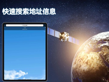
Sampled from 4 of 北斗导航手机版-北斗三号卫星地图精准定位导航的软件's App Store screenshots — background, accent and theme, measured by LaunchShots (not something Apple publishes).
#040404 bg
#272727
#244474 accent
#FFFFFF text
Screenshots


iPad screenshots



Icon palette
About this app
探索世界,尽在掌握!国产北斗导航高清卫星地图Pro - 您的全能全景定位导航助手。 实时高清卫星影像、详实常规地图、舒适黑夜模式,自由切换。集成多种导航引擎,提供精准实时路况、快捷地址搜索与极速定位导航。找路、探景、旅游出行规划,一个App全搞定!国产精工,出行专家,专业可靠,功能强大,只为让您的每一次出行更便捷、更安心、畅通无阻。
App details
What you can learn from 北斗导航手机版-北斗三号卫星地图精准定位导航的软件
Every shipping app on the App Store has gone through the same decisions you're working through right now: which screenshot goes first, what caption sits over it, which device frame to show, what color the background should be. The 8 screenshots above are 北斗导航手机版-北斗三号卫星地图精准定位导航的软件's answers to those questions — they're public, they're real, and they made it through Apple's review.
What the numbers say: 北斗导航手机版-北斗三号卫星地图精准定位导航的软件 runs a dark set where the background shifts from screenshot to screenshot (first shot #040404) — each image has to stand on its own, so the captions carry more of the story. The accent colour we picked up, #244474, is the one to reuse for badges, arrows and highlighted words if you borrow this look. Hit Use this style to open the editor with these exact colours and drop your own screenshot in.
Notice the first screenshot in particular. It's the one users see in search results and on the product page, and it's where most apps spend their best caption and tightest design. Look at the proportion of background to phone, where the text sits, what one thing the image is trying to communicate.
Want to see how other Navigation apps approach the same problem? Browse more Navigation apps in the showcase.
Take what works into your own screenshots
Open LaunchShots and design your App Store & Google Play screenshots — pick a device frame, drop captions, ship in minutes. Free, in your browser.
Open the screenshot editor →Apps with a similar look
Closest background + accent colours among the listings we've analysed — useful when you want to see the same palette handled by a different team.