Chart position — tracked daily by LaunchShots
Screenshot changes — detected by LaunchShots
Screenshot style breakdown
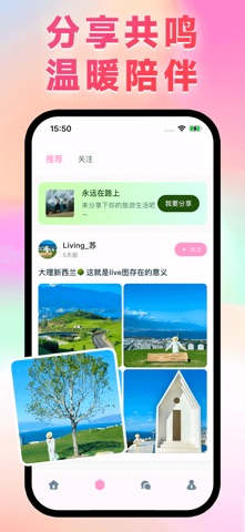
Sampled from 4 of 甜梦's App Store screenshots — background, accent and theme, measured by LaunchShots (not something Apple publishes).
#FCCCBC bg
#DDB3A5
#F44C7C accent
#111111 text
Screenshots



Icon palette
About this app
甜梦 - 让每个瞬间都值得被珍藏 不只是旅行,更是生活的诗意表达 甜梦是一个充满温度的旅行社交平台,我们相信每个人心中都有一个关于远方的梦想。在这里,"翻山 悦己"不仅仅是口号,更是一种生活态度——用脚步丈量世界,用心灵感受生活。 重新定义旅行分享 故事化的内容创作 告别枯燥的流水账,甜梦鼓励用户用故事的方式分享旅行。我们的智能编辑器让每一篇分享都像精心撰写的游记,配合精美的图片排版,让阅读成为一种享受。 真实的人格化社交 摒弃虚假的网络社交,甜梦专注于真实的情感连接。通过独创的"签名首聊"功能,让每次对话都从最真实的自我介绍开始,拉近陌生人之间的距离。 发现身边的美好 不必远行千里才能分享美好。甜梦鼓励用户记录身边的小确幸,一杯咖啡的温暖、一朵花的绽放、一个微笑的瞬间,都值得被分享和珍藏。 独特的用户体验 沉浸式的视觉体验 采用对方头像作为聊天背景的创新设计,让每次对话都像在对方的世界里漫步。流畅的动画效果和精致的界面设计,让使用甜梦成为一种视觉享受。 甜梦不追求庞大的用户规模,而专注于打造有质量的社区文…
App details
What you can learn from 甜梦
Every shipping app on the App Store has gone through the same decisions you're working through right now: which screenshot goes first, what caption sits over it, which device frame to show, what color the background should be. The 4 screenshots above are 甜梦's answers to those questions — they're public, they're real, and they made it through Apple's review.
What the numbers say: 甜梦 runs a light set where the background shifts from screenshot to screenshot (first shot #FCCCBC) — each image has to stand on its own, so the captions carry more of the story. The accent colour we picked up, #F44C7C, is the one to reuse for badges, arrows and highlighted words if you borrow this look. Hit Use this style to open the editor with these exact colours and drop your own screenshot in.
Notice the first screenshot in particular. It's the one users see in search results and on the product page, and it's where most apps spend their best caption and tightest design. Look at the proportion of background to phone, where the text sits, what one thing the image is trying to communicate.
Want to see how other Entertainment apps approach the same problem? Browse more Entertainment apps in the showcase.
Take what works into your own screenshots
Open LaunchShots and design your App Store & Google Play screenshots — pick a device frame, drop captions, ship in minutes. Free, in your browser.
Open the screenshot editor →Apps with a similar look
Closest background + accent colours among the listings we've analysed — useful when you want to see the same palette handled by a different team.