Screenshot changes — detected by LaunchShots
Screenshot style breakdown
Sampled from 5 of ゼンレスゾーンゼロ・クラウド版's App Store screenshots — background, accent and theme, measured by LaunchShots (not something Apple publishes).
#040404 bg
#272727
#844454 accent
#FFFFFF text
Screenshots


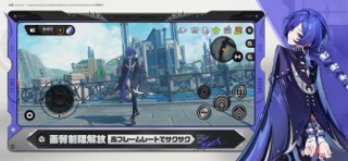
iPad screenshots


Icon palette
About this app
『ゼンレスゾーンゼロ・クラウド版』は、HoYoverseのクラウド技術を採用し、『ゼンレスゾーンゼロ』のゲーム特性に合わせて最適化された公式クラウドゲームです。『ゼンレスゾーンゼロ』の完全版をダウンロードすることなく、高画質・高フレームレート・瞬時起動のゲーム体験をお楽しみいただけます。 ※初めて『ゼンレスゾーンゼロ・クラウド版』にログインすると10時間分の無料時間を受け取ることができます(1つのHoYoverse通行証につき1回のみ受取可能)。ただし、演算パワーのリソースには限りがあるため、無料体験では長時間の待機が発生する可能性がございます。予めご了承ください。無料時間は『ゼンレスゾーンゼロ・クラウド版』の運営期間中に長期的に有効ですので、混雑時を避けて『ゼンレスゾーンゼロ・クラウド版』をご利用いただけます。 ホロウに入ってはならない。 もちろん、ホロウの中にはエーテル資源、異化の産物、さらには旧文明の遺跡など、貴重な宝が溢れている。 しかし、忘れてはいけない。ホロウの中は混沌に満ちた空間。そこでは化け物が…
App details
What you can learn from ゼンレスゾーンゼロ・クラウド版
Every shipping app on the App Store has gone through the same decisions you're working through right now: which screenshot goes first, what caption sits over it, which device frame to show, what color the background should be. The 10 screenshots above are ゼンレスゾーンゼロ・クラウド版's answers to those questions — they're public, they're real, and they made it through Apple's review.
What the numbers say: ゼンレスゾーンゼロ・クラウド版 runs a mixed light-and-dark set where the background shifts from screenshot to screenshot (first shot #040404) — each image has to stand on its own, so the captions carry more of the story. The accent colour we picked up, #844454, is the one to reuse for badges, arrows and highlighted words if you borrow this look. Hit Use this style to open the editor with these exact colours and drop your own screenshot in.
Notice the first screenshot in particular. It's the one users see in search results and on the product page, and it's where most apps spend their best caption and tightest design. Look at the proportion of background to phone, where the text sits, what one thing the image is trying to communicate.
Want to see how other Games apps approach the same problem? Browse more Games apps in the showcase.
Take what works into your own screenshots
Open LaunchShots and design your App Store & Google Play screenshots — pick a device frame, drop captions, ship in minutes. Free, in your browser.
Open the screenshot editor →Apps with a similar look
Closest background + accent colours among the listings we've analysed — useful when you want to see the same palette handled by a different team.