Screenshot style breakdown
Sampled from 5 of ポイム's App Store screenshots — background, accent and theme, measured by LaunchShots (not something Apple publishes).
#345CD4 bg
#5072DA
#8494DC accent
#FFFFFF text
Screenshots

Icon palette
About this app
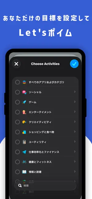
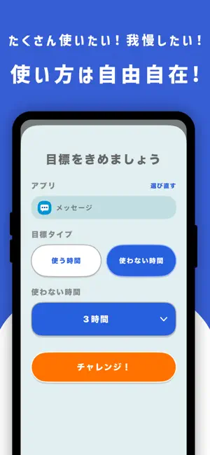
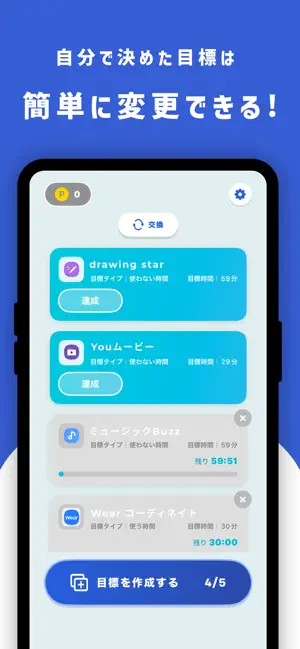
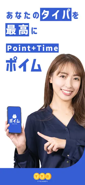
ポイムへようこそ! ポイムはあなたのスマホの使いすぎ防止や、学習アプリなどの継続を支援するアプリです。 自分自身に合った目標を設定出来るので、どんな人でもお使いいただけます。 設定した目標を達成できたらポイントがもらえるので、コツコツ続けてより良いスマホライフを目指しましょう! ポイムの使い方 ①まずは目標に設定するアプリを選びます(複数選ぶことも可能) ②次に、そのアプリの使用時間、使用しない時間のどちらを計測するか選びます ③最後に、目標とする時間を設定します 例えばこんな状況で使えます - つい開いてしまうSNSを1時間我慢する - 英語学習アプリを30分がんばる - PC作業中にゲームアプリを開かないように、ゲームを全部3時間我慢しよう こんな人にオススメ - スマホの使いすぎが気になる人 - 学習アプリが続かない人 - ついついスマホを開いてしまう人 - 手軽なポイ活アプリを探している人 アプリ内のポイントは、株式会社TT(東京都港区)が独自に運営しているものです。 株式会社TTは東証グロース市場上場企業…
App details
What you can learn from ポイム
Every shipping app on the App Store has gone through the same decisions you're working through right now: which screenshot goes first, what caption sits over it, which device frame to show, what color the background should be. The 5 screenshots above are ポイム's answers to those questions — they're public, they're real, and they made it through Apple's review.
What the numbers say: ポイム runs a mixed light-and-dark set where the background shifts from screenshot to screenshot (first shot #345CD4) — each image has to stand on its own, so the captions carry more of the story. The accent colour we picked up, #8494DC, is the one to reuse for badges, arrows and highlighted words if you borrow this look. Hit Use this style to open the editor with these exact colours and drop your own screenshot in.
Notice the first screenshot in particular. It's the one users see in search results and on the product page, and it's where most apps spend their best caption and tightest design. Look at the proportion of background to phone, where the text sits, what one thing the image is trying to communicate.
Want to see how other Lifestyle apps approach the same problem? Browse more Lifestyle apps in the showcase.
Take what works into your own screenshots
Open LaunchShots and design your App Store & Google Play screenshots — pick a device frame, drop captions, ship in minutes. Free, in your browser.
Open the screenshot editor →Apps with a similar look
Closest background + accent colours among the listings we've analysed — useful when you want to see the same palette handled by a different team.