Chart position — tracked daily by LaunchShots
Screenshot changes — detected by LaunchShots
Screenshot style breakdown
Sampled from 6 of FUNWAVES(ファンウェーブス)'s App Store screenshots — background, accent and theme, measured by LaunchShots (not something Apple publishes).
#FCFCFC bg
#DDDDDD
#0CA4CC accent
#111111 text
Screenshots



Icon palette
About this app
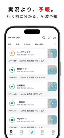
サイズだけじゃ、判断できない。 波の“質”まで予測するAI波予報 — FUNWAVES(ファンウェーブス) 「今日はどこが一番いい?」を、行く前に。 波の高さだけでなく、風・うねり・周期・潮位・地形までまとめて見て、外さないポイント選びをサポートします。 ________________________________________ 実況より、予報。 • ポイント別に 波高 / 周期 / うねり / 風向・風速 / 潮位 を一括表示 • 面の状態(荒れ・整い)/波の形/セット感まで考慮した評価 • 複数ポイントをスコアで比較でき、迷いが減る 「行ってみたらダンパーだった…」を減らすための、実戦向けの波予報です。 ※本アプリの情報は参考情報であり、安全を保証するものではありません。 ________________________________________ 有名ポイントだけじゃない。ローカルまでカバー • 全国のサーフポイントを幅広く収録 • ポイントの向き・地形の違いを踏まえた評価で、**“その場所のクセ”**まで判断しやすい 混雑を避けたい日でも、行く前に選択肢が持てます。 ______…
App details
What you can learn from FUNWAVES(ファンウェーブス)
Every shipping app on the App Store has gone through the same decisions you're working through right now: which screenshot goes first, what caption sits over it, which device frame to show, what color the background should be. The 7 screenshots above are FUNWAVES(ファンウェーブス)'s answers to those questions — they're public, they're real, and they made it through Apple's review.
What the numbers say: FUNWAVES(ファンウェーブス) runs a light set with one background colour (#FCFCFC) carried across every screenshot — the listing reads as a single poster when the shots sit side by side in search results. The accent colour we picked up, #0CA4CC, is the one to reuse for badges, arrows and highlighted words if you borrow this look. Hit Use this style to open the editor with these exact colours and drop your own screenshot in.
Notice the first screenshot in particular. It's the one users see in search results and on the product page, and it's where most apps spend their best caption and tightest design. Look at the proportion of background to phone, where the text sits, what one thing the image is trying to communicate.
Want to see how other Weather apps approach the same problem? Browse more Weather apps in the showcase.
Take what works into your own screenshots
Open LaunchShots and design your App Store & Google Play screenshots — pick a device frame, drop captions, ship in minutes. Free, in your browser.
Open the screenshot editor →Apps with a similar look
Closest background + accent colours among the listings we've analysed — useful when you want to see the same palette handled by a different team.