Screenshot changes — detected by LaunchShots
Screenshot style breakdown
Sampled from 4 of MemurJet: Kamu Personeli Alımı's App Store screenshots — background, accent and theme, measured by LaunchShots (not something Apple publishes).
#2C2C5C bg
#494972
#7C6C4C accent
#FFFFFF text
Reading the caption text from the screenshots in your browser…
Screenshots


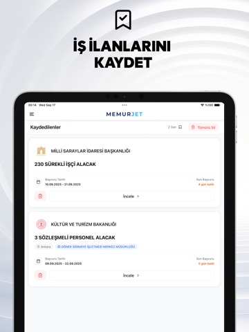
iPad screenshots


Icon palette
About this app
Bir memur alımı ilanını bir daha kaçırma; MemurJet yeni ilanları sana anında bildirir. Türkiye'nin kamu personel alımı ilanlarını tek, sade ve hızlı bir uygulamada topladık. İlini seç, KPSS puanına göre filtrele, son başvuru tarihini takip et ve başvuruya hazır ol. YENİ İLAN BİLDİRİMİ Sana uygun memur ve kamu ilanı yayınlandığında anında haberdar ol. Fırsatı ilk sen yakala. İLİNE GÖRE FİLTRELE İl ve ilçe seç, sana en yakın ilanları gör. Tüm Türkiye geneli alımları ayrıca süz. KPSS'YE GÖRE BUL KPSS puan türü ve taban puanına göre başvurabileceğin ilanları kolayca ayıkla. SON BAŞVURUYU KAÇIRMA Her ilanda kalan gün net görünür; süresi geçen ilanlar listede yer almaz. KAYDET VE TAKİP ET Beğendiğin ilanları kaydet, sonra tek dokunuşla geri dön. TEK DOKUNUŞLA BAŞVUR Unvan, kadro sayısı, öğrenim düzeyi ve gerekli belgeleri gör; resmi başvuru sayfasına anında git. İlanı arkadaşlarınla pa…
App details
What you can learn from MemurJet: Kamu Personeli Alımı
Every shipping app on the App Store has gone through the same decisions you're working through right now: which screenshot goes first, what caption sits over it, which device frame to show, what color the background should be. The 8 screenshots above are MemurJet: Kamu Personeli Alımı's answers to those questions — they're public, they're real, and they made it through Apple's review.
What the numbers say: MemurJet: Kamu Personeli Alımı runs a dark set with one background colour (#2C2C5C) carried across every screenshot — the listing reads as a single poster when the shots sit side by side in search results. The accent colour we picked up, #7C6C4C, is the one to reuse for badges, arrows and highlighted words if you borrow this look. Hit Use this style to open the editor with these exact colours and drop your own screenshot in.
Notice the first screenshot in particular. It's the one users see in search results and on the product page, and it's where most apps spend their best caption and tightest design. Look at the proportion of background to phone, where the text sits, what one thing the image is trying to communicate.
Want to see how other News apps approach the same problem? Browse more News apps in the showcase.
Take what works into your own screenshots
Open LaunchShots and design your App Store & Google Play screenshots — pick a device frame, drop captions, ship in minutes. Free, in your browser.
Open the screenshot editor →Apps with a similar look
Closest background + accent colours among the listings we've analysed — useful when you want to see the same palette handled by a different team.