Chart position — tracked daily by LaunchShots
Screenshot changes — detected by LaunchShots
Screenshot style breakdown
Sampled from 3 of ハザードマップ - 洪水・浸水・土砂・冠水の災害に備える's App Store screenshots — background, accent and theme, measured by LaunchShots (not something Apple publishes).
#FCFCFC bg
#DDDDDD
#145C64 accent
#111111 text
Screenshots

iPad screenshots

Icon palette
About this app
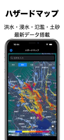
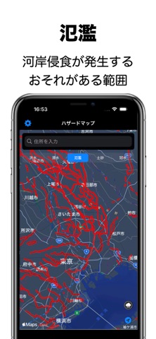
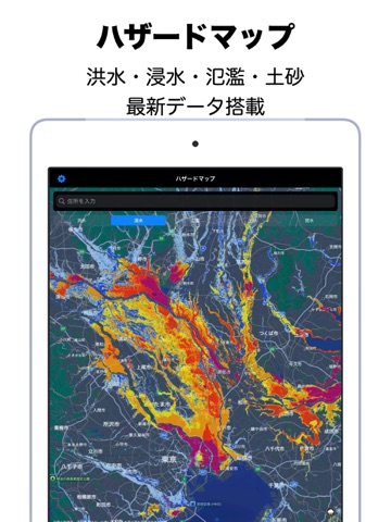
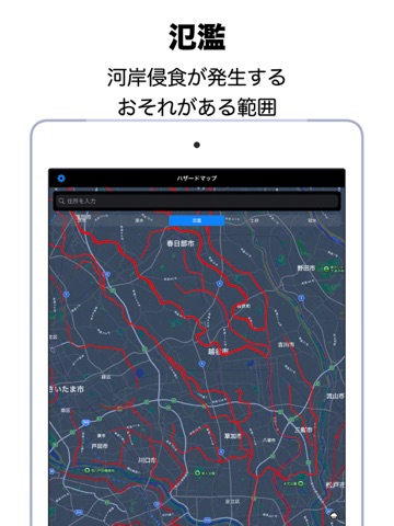
【説明文】 本アプリは、国土交通省が公開するハザードマップデータをもとに、洪水・浸水・土砂災害・高潮などのリスクを地図上で簡単に確認できるアプリです。 災害が発生する前に、自宅や学校、職場など身近な地域のリスクを把握し、防災に役立てることができます。 【主な機能】 ・ハザードマップ表示 洪水・浸水・土砂災害などの危険エリアを色分け表示 ・雨雲レーダー 13時間先までの雨雲の動きを確認可能 ・位置情報検索 住所や現在地からすぐに災害リスクをチェック ・直感的な操作 拡大・縮小やスクロールで簡単にエリアを移動可能 【このアプリでできること】 ・災害時の避難経路や避難所の検討 ・自宅や実家、職場、学校の安全確認 ・旅行や引越し前のリスク確認 【本アプリケーションについて】 ○ 対応機種 : iOS 15.0~ 今後もご要望にお答えしていきたいと思いますので、 ご要望などあれば、どんどんお知らせください! 国や自治体が提供する信頼できるデータを利用しているため、安心してご活用いただけます。 日頃の備えに、このアプリ…
App details
What you can learn from ハザードマップ - 洪水・浸水・土砂・冠水の災害に備える
Every shipping app on the App Store has gone through the same decisions you're working through right now: which screenshot goes first, what caption sits over it, which device frame to show, what color the background should be. The 6 screenshots above are ハザードマップ - 洪水・浸水・土砂・冠水の災害に備える's answers to those questions — they're public, they're real, and they made it through Apple's review.
What the numbers say: ハザードマップ - 洪水・浸水・土砂・冠水の災害に備える runs a light set with one background colour (#FCFCFC) carried across every screenshot — the listing reads as a single poster when the shots sit side by side in search results. The accent colour we picked up, #145C64, is the one to reuse for badges, arrows and highlighted words if you borrow this look. Hit Use this style to open the editor with these exact colours and drop your own screenshot in.
Notice the first screenshot in particular. It's the one users see in search results and on the product page, and it's where most apps spend their best caption and tightest design. Look at the proportion of background to phone, where the text sits, what one thing the image is trying to communicate.
Want to see how other Weather apps approach the same problem? Browse more Weather apps in the showcase.
Take what works into your own screenshots
Open LaunchShots and design your App Store & Google Play screenshots — pick a device frame, drop captions, ship in minutes. Free, in your browser.
Open the screenshot editor →Apps with a similar look
Closest background + accent colours among the listings we've analysed — useful when you want to see the same palette handled by a different team.