Chart position — tracked daily by LaunchShots
Screenshot style breakdown
Sampled from 5 of GOFIN Gazeta Podatkowa's App Store screenshots — background, accent and theme, measured by LaunchShots (not something Apple publishes).
#FCFCFC bg
#DDDDDD
#142C7C accent
#111111 text
Screenshots

iPad screenshots
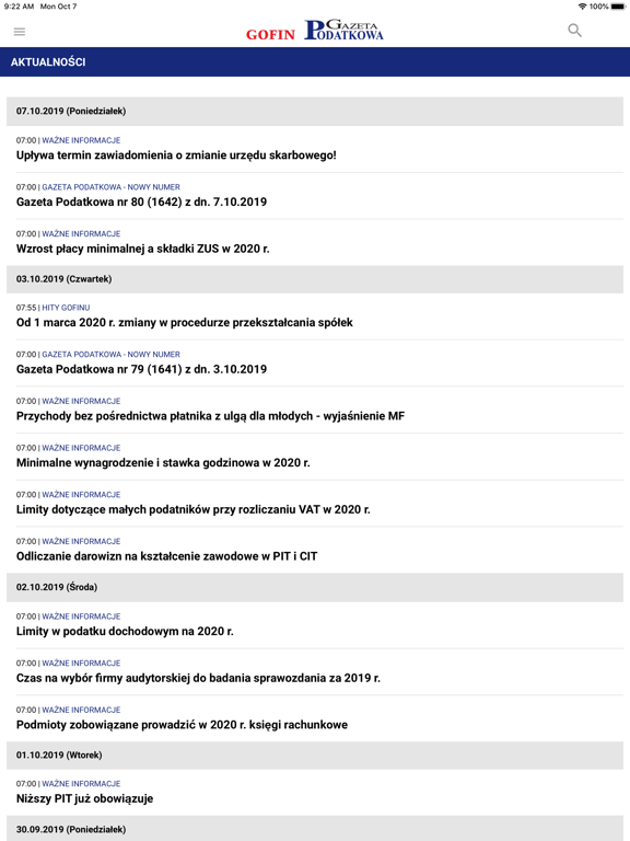
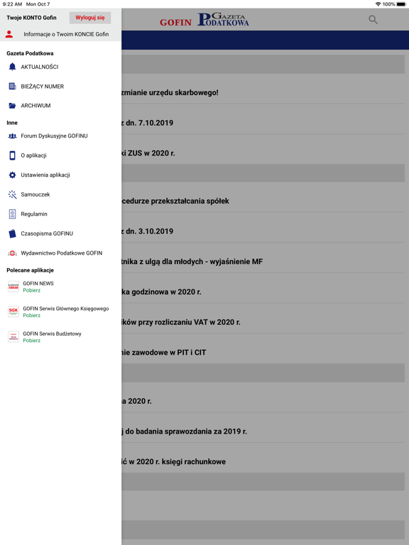

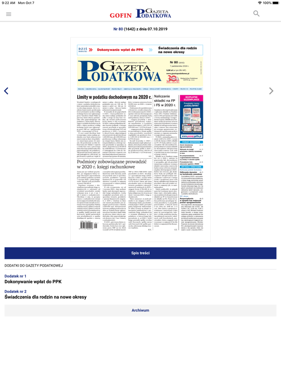

Icon palette
About this app
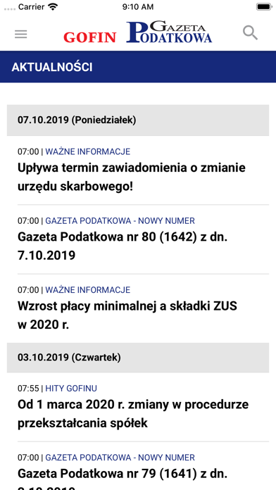
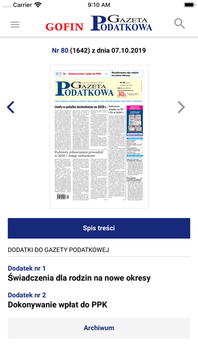
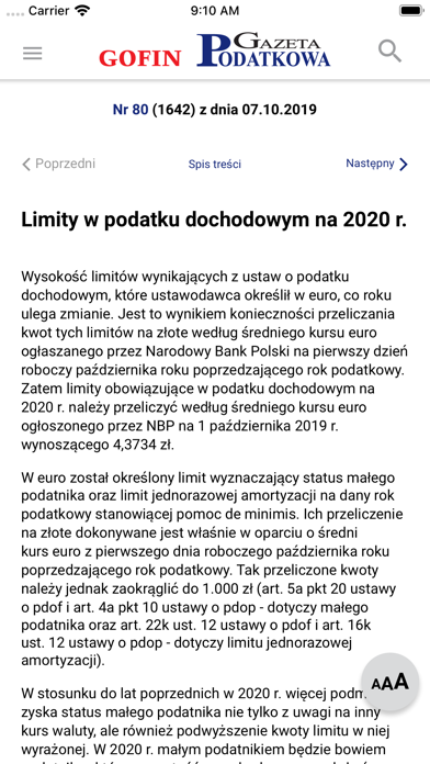
Aplikacja GOFIN Gazeta Podatkowa umożliwia błyskawiczny dostęp do aktualności oraz bieżących i archiwalnych wydań Gazety Podatkowej, a także dołączanych do niej dodatków. Gazeta Podatkowa to ŚWIETNE źródło informacji niezbędnych dla księgowych, kadrowców, przedsiębiorców, podatników i płatników. Zdecydowanie dominują w niej zagadnienia z zakresu podatków (szczególnie podatku VAT i podatku dochodowego), prawa pracy, ubezpieczeń społecznych i świadczeń ZUS oraz rachunkowości. Omawia również problematykę postępowania przed organami podatkowymi, prawa gospodarczego i rodzinnego. Na łamach Gazety opisywane są bieżące informacje, w tym zmiany przepisów prawnych. Prezentowane są stanowiska organów podatkowych oraz wyroki sądów z komentarzami redakcyjnymi. Publikowane teksty rozstrzygają problemy zgłaszane przez Czytelników, zawierają dużo praktycznych wyjaśnień i przykładów. Aplikacja GOFIN …
App details
What you can learn from GOFIN Gazeta Podatkowa
Every shipping app on the App Store has gone through the same decisions you're working through right now: which screenshot goes first, what caption sits over it, which device frame to show, what color the background should be. The 10 screenshots above are GOFIN Gazeta Podatkowa's answers to those questions — they're public, they're real, and they made it through Apple's review.
What the numbers say: GOFIN Gazeta Podatkowa runs a light set with one background colour (#FCFCFC) carried across every screenshot — the listing reads as a single poster when the shots sit side by side in search results. The accent colour we picked up, #142C7C, is the one to reuse for badges, arrows and highlighted words if you borrow this look. Hit Use this style to open the editor with these exact colours and drop your own screenshot in.
Notice the first screenshot in particular. It's the one users see in search results and on the product page, and it's where most apps spend their best caption and tightest design. Look at the proportion of background to phone, where the text sits, what one thing the image is trying to communicate.
Want to see how other News apps approach the same problem? Browse more News apps in the showcase.
Take what works into your own screenshots
Open LaunchShots and design your App Store & Google Play screenshots — pick a device frame, drop captions, ship in minutes. Free, in your browser.
Open the screenshot editor →Apps with a similar look
Closest background + accent colours among the listings we've analysed — useful when you want to see the same palette handled by a different team.