Screenshot style breakdown
Sampled from 4 of Özata İK's App Store screenshots — background, accent and theme, measured by LaunchShots (not something Apple publishes).
#FCFCFC bg
#DDDDDD
#A49C64 accent
#111111 text
Screenshots

Icon palette
About this app
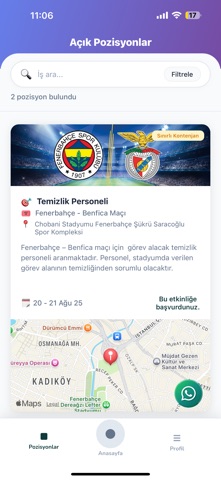
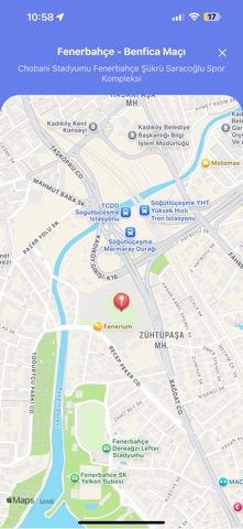
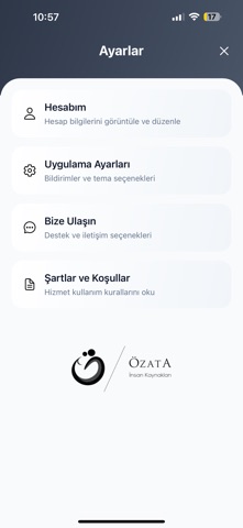
Özata İK, geçici iş pozisyonları ve etkinlik personeli arayanlar için tasarlanmış kapsamlı bir istihdam uygulamasıdır. Ana özellikler: • İş ilanları: Güncel pozisyonları keşfedin ve hızlıca başvurun. • Harita entegrasyonu: Size en yakın iş fırsatlarını görün. • Gerçek zamanlı bildirimler: Yeni ilanları ve başvuru durumlarınızı takip edin. • Profil yönetimi: Kişisel bilgilerinizi ve belgelerinizi güvenle saklayın. • Başvuru takibi: Geçmiş ve aktif başvurularınızı kolayca yönetin. Uygulama özellikleri: • SMS ile hızlı giriş • Detaylı filtreleme ve arama seçenekleri • Konum bazlı iş önerileri • Aylık istatistikler ve performans takibi • Güvenli belge yükleme Bonus oyunlar: • Dino Game • Sudoku • Lights Out • Red Light Green Light Güvenlik: • Uçtan uca şifreleme • Güvenli veri depolama • KVKK uyumlu veri işleme Özata İK ile iş fırsatlarını keşfedin ve anında başvurun.
App details
What you can learn from Özata İK
Every shipping app on the App Store has gone through the same decisions you're working through right now: which screenshot goes first, what caption sits over it, which device frame to show, what color the background should be. The 4 screenshots above are Özata İK's answers to those questions — they're public, they're real, and they made it through Apple's review.
What the numbers say: Özata İK runs a mixed light-and-dark set where the background shifts from screenshot to screenshot (first shot #FCFCFC) — each image has to stand on its own, so the captions carry more of the story. The accent colour we picked up, #A49C64, is the one to reuse for badges, arrows and highlighted words if you borrow this look. Hit Use this style to open the editor with these exact colours and drop your own screenshot in.
Notice the first screenshot in particular. It's the one users see in search results and on the product page, and it's where most apps spend their best caption and tightest design. Look at the proportion of background to phone, where the text sits, what one thing the image is trying to communicate.
Want to see how other Business apps approach the same problem? Browse more Business apps in the showcase.
Take what works into your own screenshots
Open LaunchShots and design your App Store & Google Play screenshots — pick a device frame, drop captions, ship in minutes. Free, in your browser.
Open the screenshot editor →Apps with a similar look
Closest background + accent colours among the listings we've analysed — useful when you want to see the same palette handled by a different team.